YouView is an on-demand TV service with live free-to-air digital TV and radio channels. It combines seven-day catch-up with a library of on-demand programmes, films and radio.
Challenge
To design an app that integrated the best features of the YouView set-top box while taking advantage of the iOS platform.
Product
YouView is a PVR/IPTV set-top box which features services from the BBC, ITV, Channel 4, Five, BT and Talk Talk. It combines Freeview with an innovative new interface that integrates catch-up TV from all the major broadcasters into one seamless package.

Design
It was clear to us that the iPhone had a lot more to offer the user. So rather than just having a remote control app, we pushed to reinvent the YouView interface on the iPhone and use the set-top box as a means to just play the content.
I worked together with the Lead UX designer to come up with concepts that we presented to the CEO.
Spatial model
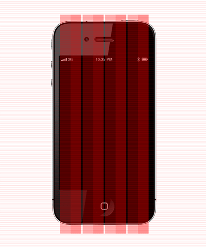
I wanted us to really think about the space and dimensions of the iPhone interface. I began the design process by drawing out spatial points for navigation and content. I felt this would help ground our ideas and positioning on any issues that might arise.

Typography
The YouView font was FS Me – a san-serif typeface already well designed for usage across multiple platforms. FS Me is designed specifically to improve legibility for people with learning disabilities.

Grid
I went with a practical grid made up of four columns with 14pt baseline.
Concepts
I began my conceptual process by using the UX documents as a starting point to understanding what data and elements needed to be on screen. The main approach was to apply the current IA on the set-top box, whilst applying it all according to YouView’s design principles.
Now
Bringing together features from the Info Panel into a single concise screen.
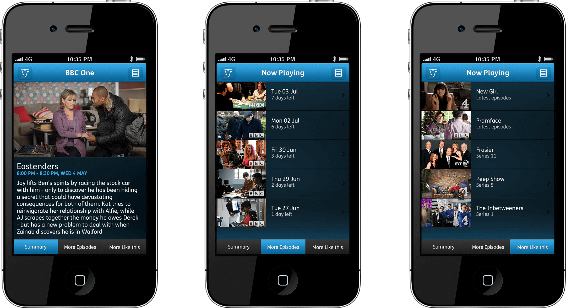
Changing channels – the feature allows the user to get a sneak peek of the next channel without having to commit to changing over.

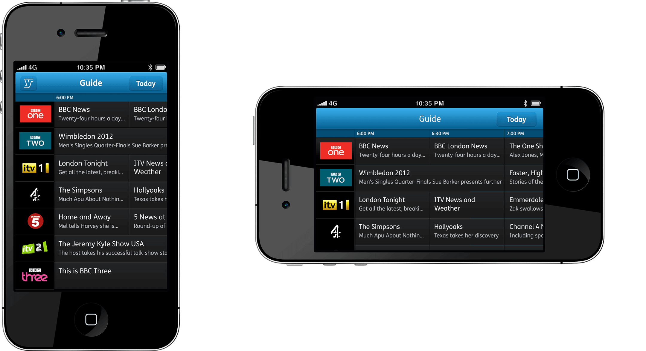
TV guide
The TV guide that users have grown to love in both portrait and landscape modes.
MyView
Bringing together features from the MyView section into a single screen. As the iPhone is such a personal device, it felt like adding a favourite feature would make sense as it kept the content local.

Filling time – everyone has been there, waiting around for your favourite tv show to start with nothing to watch in the meantime. Well this clever feature, would allow users to see how they can fill their empty time slots, with suitable content based on the time available and an algorithm that measured their interests.

Shows, not seasons
Pushing the idea of shows and collating all the seasons into a single area.


Remote control rethought
You probably have a remote control lying somewhere in between your sofa’s cushions. So why bother replicating that experience on a £500+ device that can do so much more? We decided to use two-finger gestures that could be activated anywhere. We went with two basic requests – volume and live rewinding.
I wanted to revise the way people thought about rewinding live TV. Instead of your standard playback bar, I based it around the clock – something more familiar to users.

Thumbs up
We learned so much from this project and designed for the iPhone allowed us to push through the features that mattered. It also opened up the company’s eyes to what was possible and the impact it would have on its users. A hugely successful project as a budget was assigned for the app to be built on both iOS and Android platforms.
About this project
Duration
1 month
Team size
2 designers
1 iOS developer
Software
Photoshop
Keynote