Brief
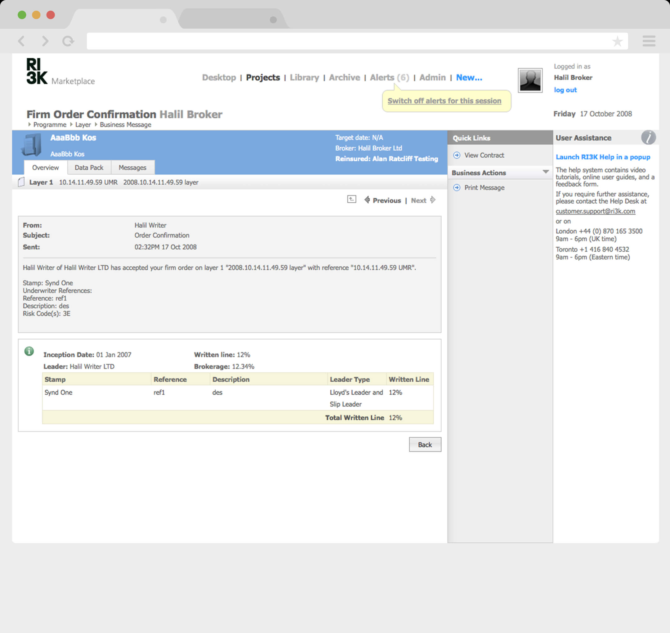
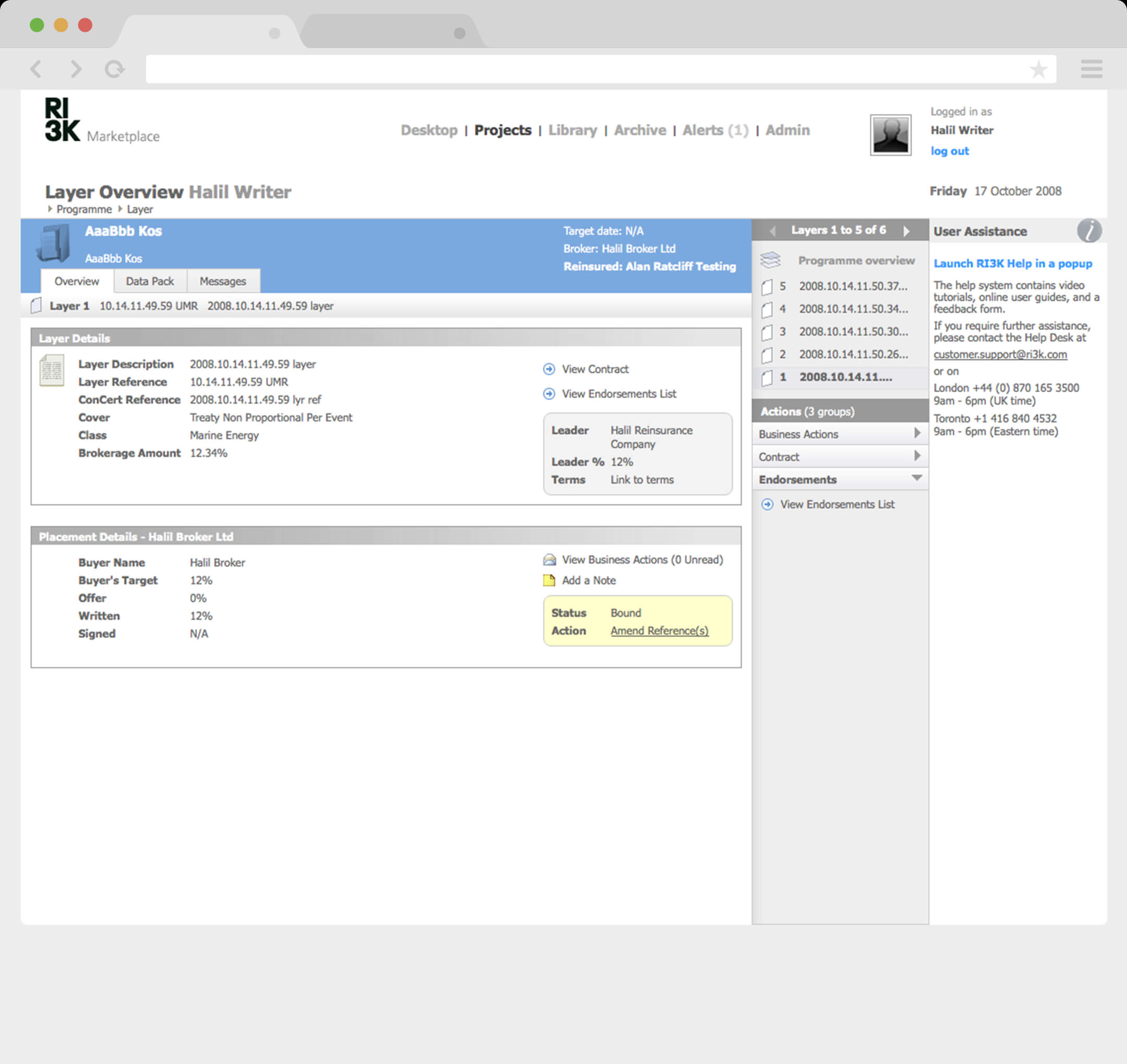
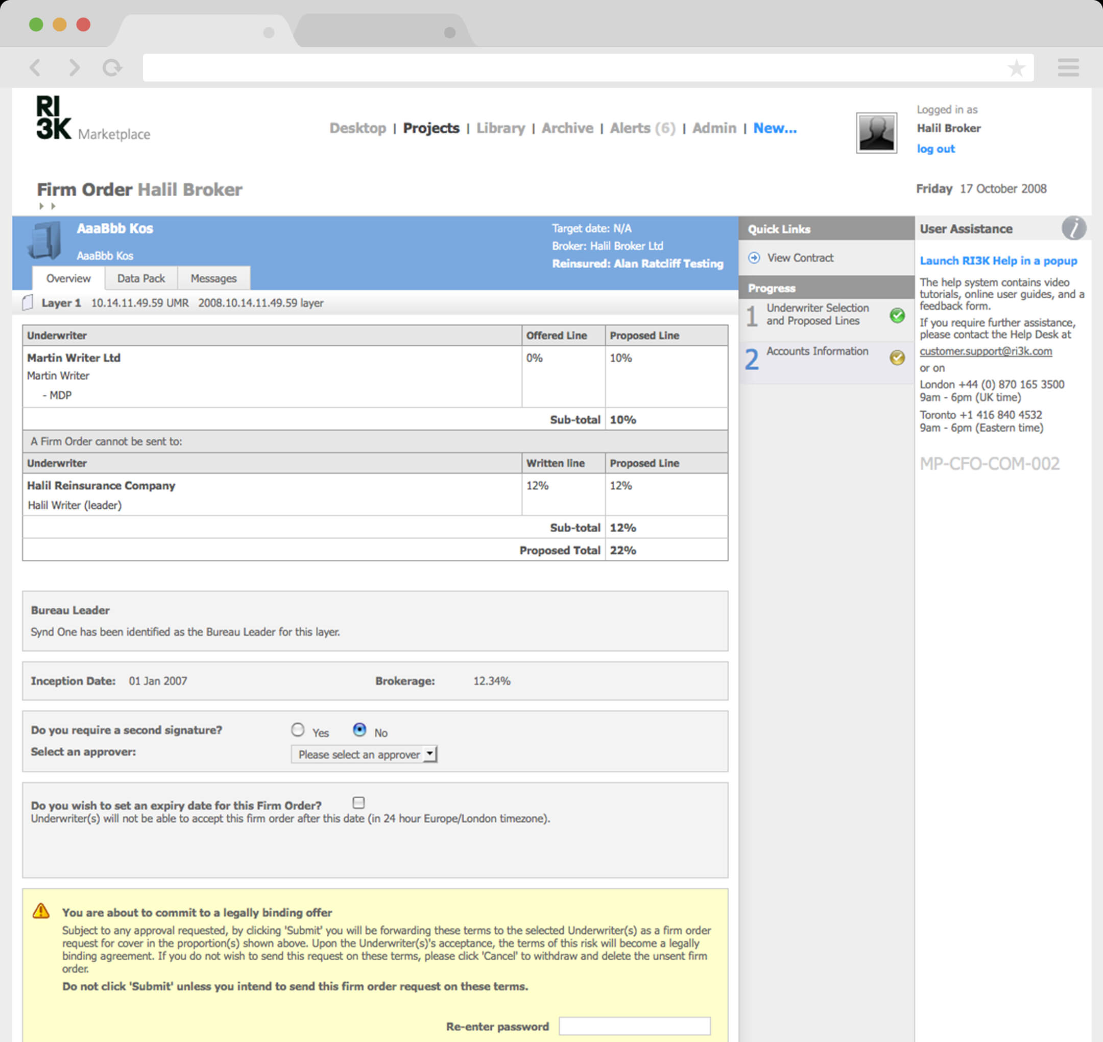
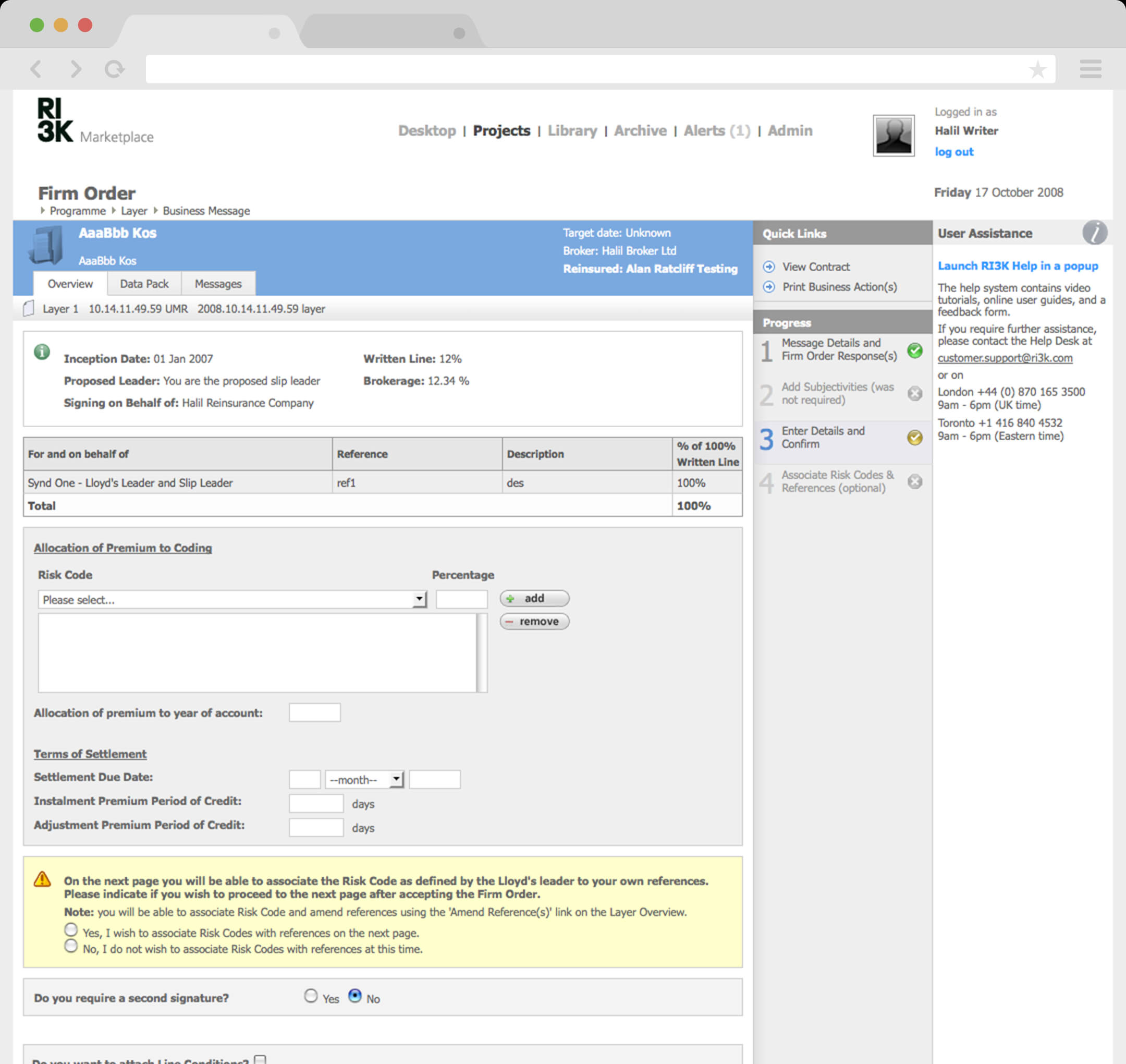
We were tasked to redesign the Firm Order Process; a complex process that is used by brokers and underwriters to insure big and difficult items such as cargo ships or buildings.
Product
RI3K (Reinsurance and Insurance for the 3rd Millennium) was a paperless trading service for the insurance and reinsurance industry. RI3K allowed all types and classes of large commercial insurance and facilitative and treaty reinsurance to be transacted over the Internet.
Real-life process
The one of the most important parts of design is to understand, especially for complex user journeys such as placing a Firm Order. Therefore, it’s vital a Business Analyst explains how it actually happens in real life. In this way, we will remove most of the static that involves designing web applications as we get to the core of things.
Placements can either be non-section or sectioned. This means a placement can be split into insuring different parts of something.
A Broker would send a Firm Order which is a legal bond agreement from the Underwriter to how much they are willing to insure a part of the section or non-section placement. The Broker would also pick specific Underwriters to lead and what kind of stamps they would like to see. These stamps would confirm a certain type of insurance policy. Endorsements are amendments to the contract sent out with the Firm Order, which can be either conditional (must accept all) or non-conditional (pick and choose).
This process diagram shows the linear view of a broker’s decision-making process.

DAYG
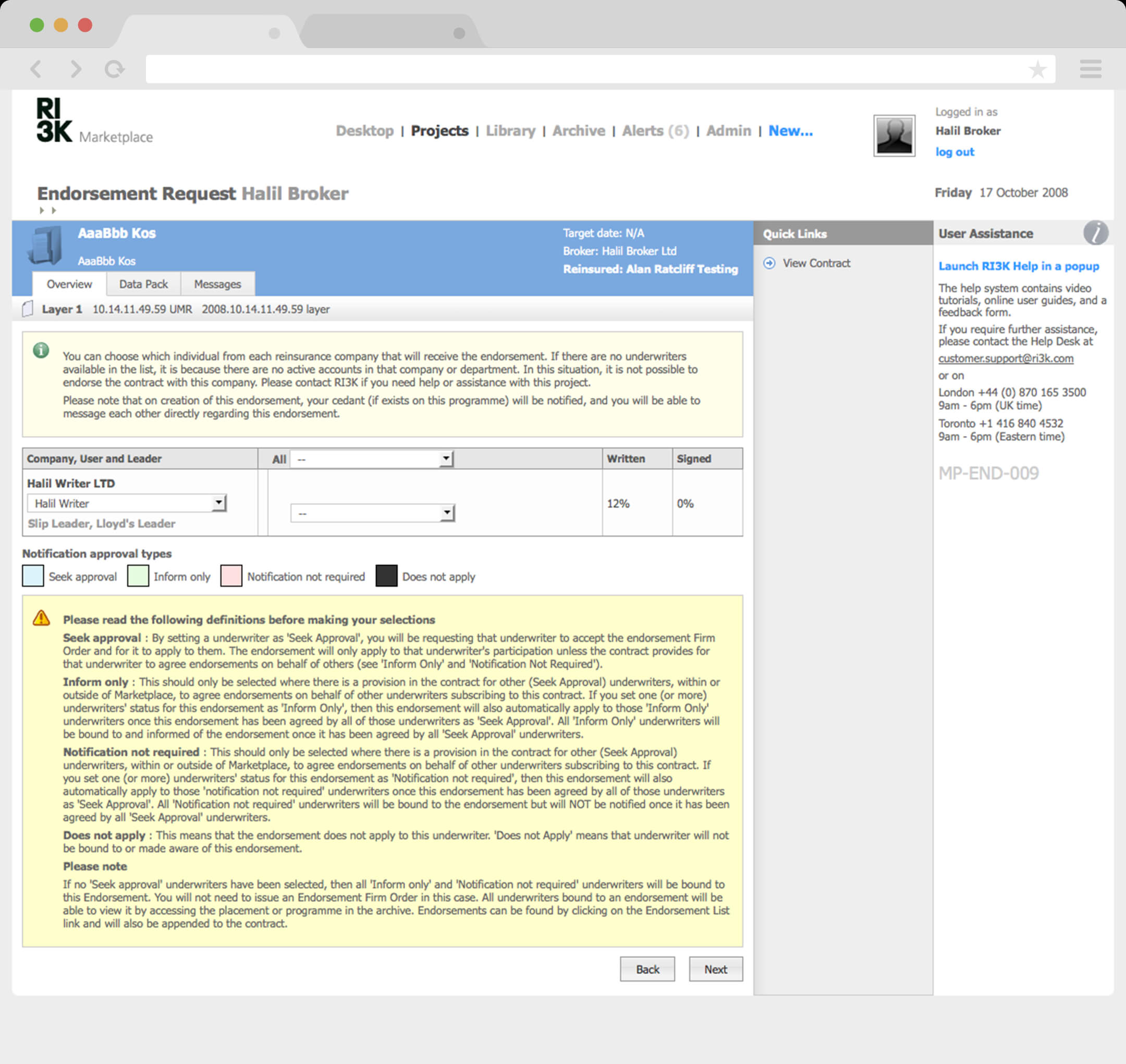
The current UI was built on what I like to call, design-as-you-go or DAYG and is in no way a criticism of the designers or developers but sometimes badly timed decisions mixed with a not-so-good understanding of agile (let’s think about it later) that add on top of each other. These DAYGs end up creating weird design patterns that end up being justified and cemented ideologies which are used to create further bad design patterns.
After we had a good idea about how things worked in the real world for brokers and underwriters. We could move on to analysing the current process, calling out what happened exactly during their firm order. We wrote an evaluation of what areas of the UI could be improved and why. The “real-life process” really helped cemented our approach.
Pages
In this process, the most logical approach is having three pages: Create, Confirm and Complete.
Breadcrumb
They highlight their current location as well as past or future tasks. This would allow the user to know what to expect and improve their confidence in the system.
Wizard
Turning this process into an isolated experience to help focus and ease of use. Forms that have step-by-step tasks need a visual object to display their whereabouts within the process.
Space
Thinking about how the three-dimensional space could be used to allow the user to understand the rhythm of the visual language.
Colours
Keeping neutral to allow for system-specific use of colours for attention, progress and waiting events. Black and White design, using typography to influence visual language.
Grids
Using a grid system to ensure we improve readability and scannability for end users.
Forms
Forms that are integrated into the design to provide a seamless feel. Validation is a compulsory issue that makes sure the form being submitted has correct data.
Save as you go
Complex forms should always allow the users to save as they go.
Lightbox
Complex processes move into wizards (Lightbox).
Traffic lights
Traffic lights – Green is go, Orange is wait, Red it stop
Feedback
Giving users the chance to get visual reverberate on the actions or processes they undergo.
In this project, I first created a visual concept to help define how the design system would work. Sometimes this is a better approach and it really depends on the project. In this case, it worked well as we had an artist’s impression that would help overwrite all the DAYGs that were built into the business mind.
Tabs
Section tabs help group each area of the firm order into manageable pieces – using iconography and colour to help with status.
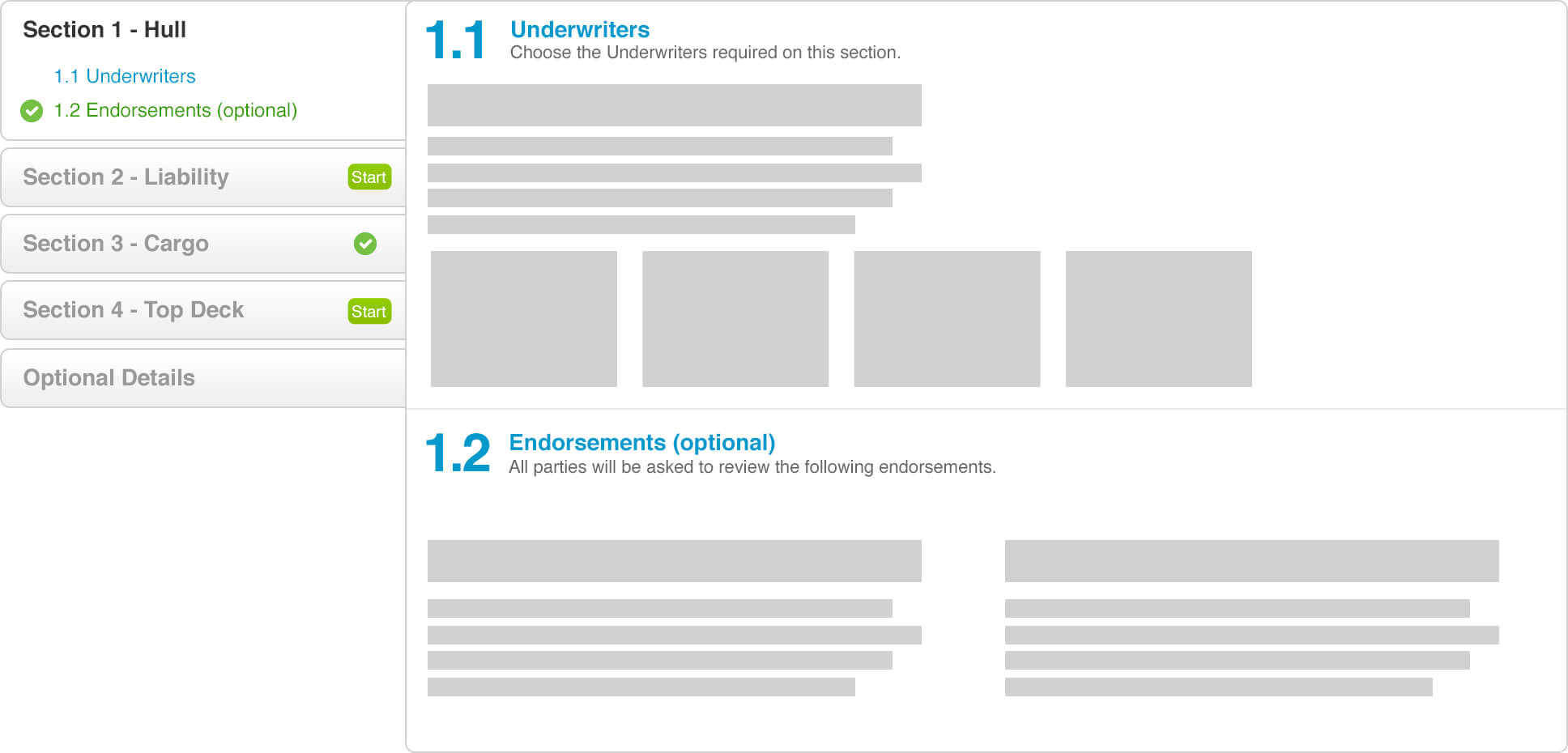
Breadcrumb
I wanted the breadcrumb to be very clear. I used sharp sections with green to help denote the active screen. The breadcrumb also be close to the title of the firm order and branding of the insurance company to help with a sense of hierarchy.

Dialogues
When a user initially creates a firm order they are taken to a new page. Firstly, to ensure that the complex process is siloed off and it is also a good method to introduce a new visual language without having to redesign the whole system all at once. We visually wanted different layers to mean different things. So we designed two layers of dialogue:
Primary dialogue would take over the screen as the action was considered important.
Secondary dialogue would be passive and block part of the page so that it be used in combination with other information on the screen.
Forms
Forms can have a tendency to take over a page and enforce its stale look and feel into the design. Users are inclined to feel a sense of frustration and boredom when they have to do with long forms that need a lot of information. We wanted the forms to be invisible in the designs. To do this, we used colour, styled buttons and dialogues to show and hide parts of the form. This managed to turn a complex and lengthy form process into an enjoyable experience while remaining professional.
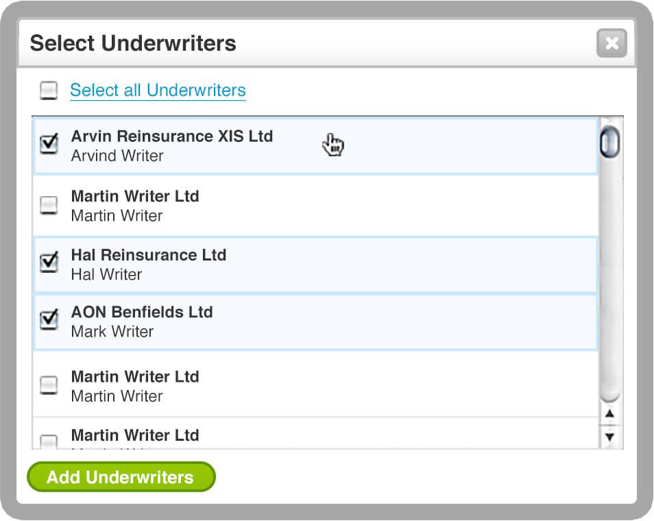
Adding an underwriter
Step 1 – Coloured button to aid the process

Step 2 – Dialogue to break up the process
Select a lead stamp
Visually styled radio buttons that act like a light switch, can be
turned on or off as well as having the ability to be mutually exclusive.
On and off states

Mutually exclusive states

Error states
Validation of complex is very important but to be able to communicate what those issues are is just as vital. It was important to get away from the JavaScript alert dialogue that the system was used to more integrated ones. We decided to design two types of error components due to the complexity of the process.
Summary
The first one provided a summary of all the errors within the form as well as an action or link beside each error state.
Inline
The second error components provide the user with inline errors so they could locate the error and the exact reason why it has failed validation.

Buttons
I wanted there to be two distinctive buttons: rounded buttons that affect the elements inside the form and square buttons that were general buttons and affected the whole form itself.

Colours
Colour is always a difficult thing to master and balance in any design. I wanted to re-strip all the colours from the current system and start with a neutral palette. This helped open up the colour palette for more important actions and information. I adapted the traffic light system throughout the whole process.

I really wanted the design to be converted perfectly into HTML and CSS as well as to work across multiple browsers. To ensure this happened, I undertook the huge task of developing an HTML prototype that had all the styling and basic JavaScript elements so that the developers could have a reference point and be able to better integrate all the designs.
This was undoubtedly one of the most complex projects that I worked on – with so many factors and complications of how people undertake a task and have to communicate with several different companies and people. However, it taught me a lot about how to go about dealing with data/information-heavy projects. It made me realise that as a designer I had to over and beyond my job spec to get projects with great UI and UX but kept to a design system that would beyond question have a long-lasting effect on the rest of the system.
As of writing this case study, RI3K was successfully sold to a financial company in Qatar.
About this project
Company
RI3K
Finance
Platform
Digital screens
Role
UX & Visual Design
Front-end development
Duration
6 months
Team size
2 designers
(including myself)
3 front-end
2 back-end
Software
Photoshop
Illustrator
Textmate
Parallels
