

About this project
128
hours of research
48
hours of workshops
15
different concepts
1
streamlined journey
Impact
Introduced a responsive design inspired by the structure of an app store, simplifying the user journey and improving engagement and conversion rates through targeted experiments.
Atlassian
Atlassian is a software company that builds platforms and tools for businesses. You might have heard of Jira Software, Confluence, Trello, and the most recently acquired Loom. Well, they build these apps. They have over 260k customers, which is around 10 million active users.
Problem
We’re seeing large drop-offs in our experience. We believe that part of this is our users not fully understanding our products and the value it could bring them.
We want to help existing teams discover and become engaged with our products. The Cross-flow Essentials team plans to build and run experiments to optimise and improve the Cross-flow conversion funnel at key drop-off moments and opportunity areas.
Outcome
We introduced a responsive design that restructured the information architecture and content, drawing inspiration from the intuitive layout of an app store. This approach aimed to facilitate seamless transitions between products and expedite users’ access to value. Through a series of targeted experiments, we achieved measurable improvements in user engagement and conversion rates. However, due to the project’s extensive scope, our team was unable to fully implement all planned enhancements.
Here is how we did it 👇
Process
We used the double-diamond process to ensure we followed a process that constantly allowed us to evolve our understanding and approach to the project. These checkpoints are based on the confidence level summarised through business and customer impact metrics and feasibility.
From a design point of view, I split the activities based on each diamond, like so…


Defining our problem
We ran workshops with a team of 10 (spanning across Engineering, Product, Design, and Data) to understand, ideate, and synthesis our strategy for the next financial year.
Workshops
The workshop was broken up into four half-day workshops that covered the following areas:
Day 1
- Background & Objective
- Insights recap
- Understand our prompt and target users
- Mapping our current state journeys
- Problem framing and opportunities
Day 2
- Day 1 recap
- Inspiration boards
- Ideal behaviours
- Future state journeys
Day 3
- Recap on opportunities
- Rapid sketching – Crazy 8's
- Refined concepts – Steal or borrow
- Concept theming
Day 4
- Hero concept development
- Risk vs Impact mapping
- Effort sizing


Problem statement
"Users have to navigate through a variety of steps, forms, and pages before they able to try a product that they do not quite understand its value yet."
Pain points
Time and friction
Cross-flow adds friction to the decision making process while prolonging time to experience to value.
So many steps
After cross-flowing there are still 5+ steps, spotlights, modals and quickstart steps before they get to start using Confluence.
What the Connie?
Confluence lacks salience – we/users have to work harder to show/find value.
What do I do now?
Their first page experience doesn’t showcase the value of Confluence.
Design tactics
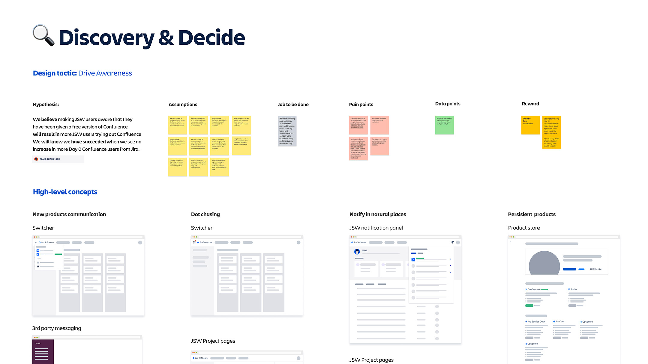
Drive awareness
How might we help our customers become more aware of our solutions.
Reduce time for evaluation
How might we help our customers get to value quicker as they are evaluating our solutions.
Focus on education
How might we make our customers feel more empowered with information to better use our products.
Showcase cohesion
How might we help our customers understand the benefits of collaborating as a team in our products.

Understanding our users
We used existing research across Atlassian to help us understand our users. At Atlassian, they use archetypes to focus on the type of user rather than their individual characteristics, which helps shift the focal point on the job to be done.
Archetypes

Team champion
A trusted member of the team, and always looking for ways to make the team more efficient. Drives work forward with the team, and evangelises processes and tools.

Team contributor
Consumes and collaborates on content, gives feedback, and provides updates on the status of the project. They want to find relevant content and know what to do next so they can get their work done.
Top tasks
The research team collected the top tasks for both archetypes based on a collective of qualitative and quantitative data. We used this information to inform our design decisions across a multitude of areas. e.g. content and visual hierarchy, CTAs, IA, etc.
- Software configuration
- Security (compliance, system, data)
- Installation (software, application)
- Application integrations (implementing, managing)
- Features and pricing
- Approvals (procurement, legal, finance)
- List requirements (integration, scalability, ease of use)
- Project planning (roadmapping, goal-setting, track productivity)
- Coordinate tasks (team, project)
- Team cohesiveness (support, motivate)
- Meetings (preparation, participation, follow-up)
- Testing
- Code writing and reviews

Journey mapping
The journey mapping exercise looked to add a holistic view of the end-to-end journey. We mapped existing research: pain points, insights, and opportunities, while adding assumptions and hypotheses to each moment to define potential solutions and success metrics.

Holistic view of the journey map

Creating hypotheses
For each moment, we added a hypothesis to frame a solution, the experience, and a success metric. This also helped us start to break up the end-to-end journey into managable chunks. An example of this would look like:
Moment
Hypthesis
Discover
We believe making JSW users aware that they have been given a free version of Confluence
will result in more JSW users trying out Confluence.
We will know we have succeeded when we see an increase in more day 0 Confluence users

Lo-fi Design
We moved on to designing lo-fi concepts that looked to address those pain points while increasing desirability and confidence through the hypotheses and HMWs we created.
Diverge
An important part of this phase is to allow the mind to explore different possibilities that touch on the playful part of the subconscious. We created boards for each moment that had different points of data: design tactic, hypothesis, assumptions, job to be done, pain points, quant data, and reward. Each of these points of data aligned the lo-fi concepts to that given moment, ensuring we were thinking about the macro while working on the micro.
We then held an ideation workshop with the whole engineering team so that they had the opportunity understand the problems and see how they would be able to solve them.


Converge
As we converged, we used the DVF framework to decide what concepts would help us achieve our goals as we progressed towards the more visual aspects of design – conveying aesthetics, simplicity, and emotion. During this phase, we also planned what moments we could fit into a 3-month engineering phase. We decide to focus on the first three parts of the journey: Discover, Decide, and Get Started.
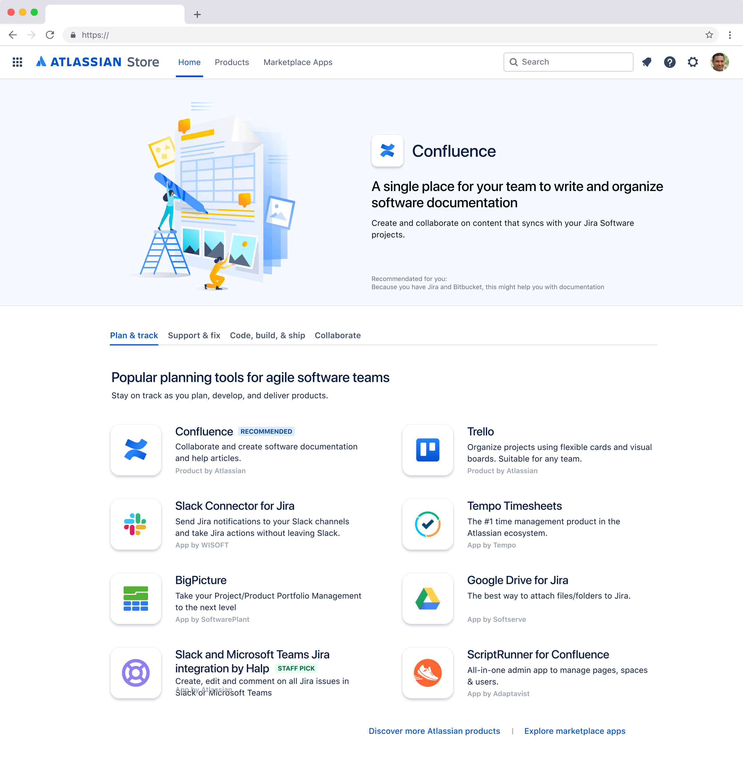
Discover in Product Store
Help me find a tool (for my needs)
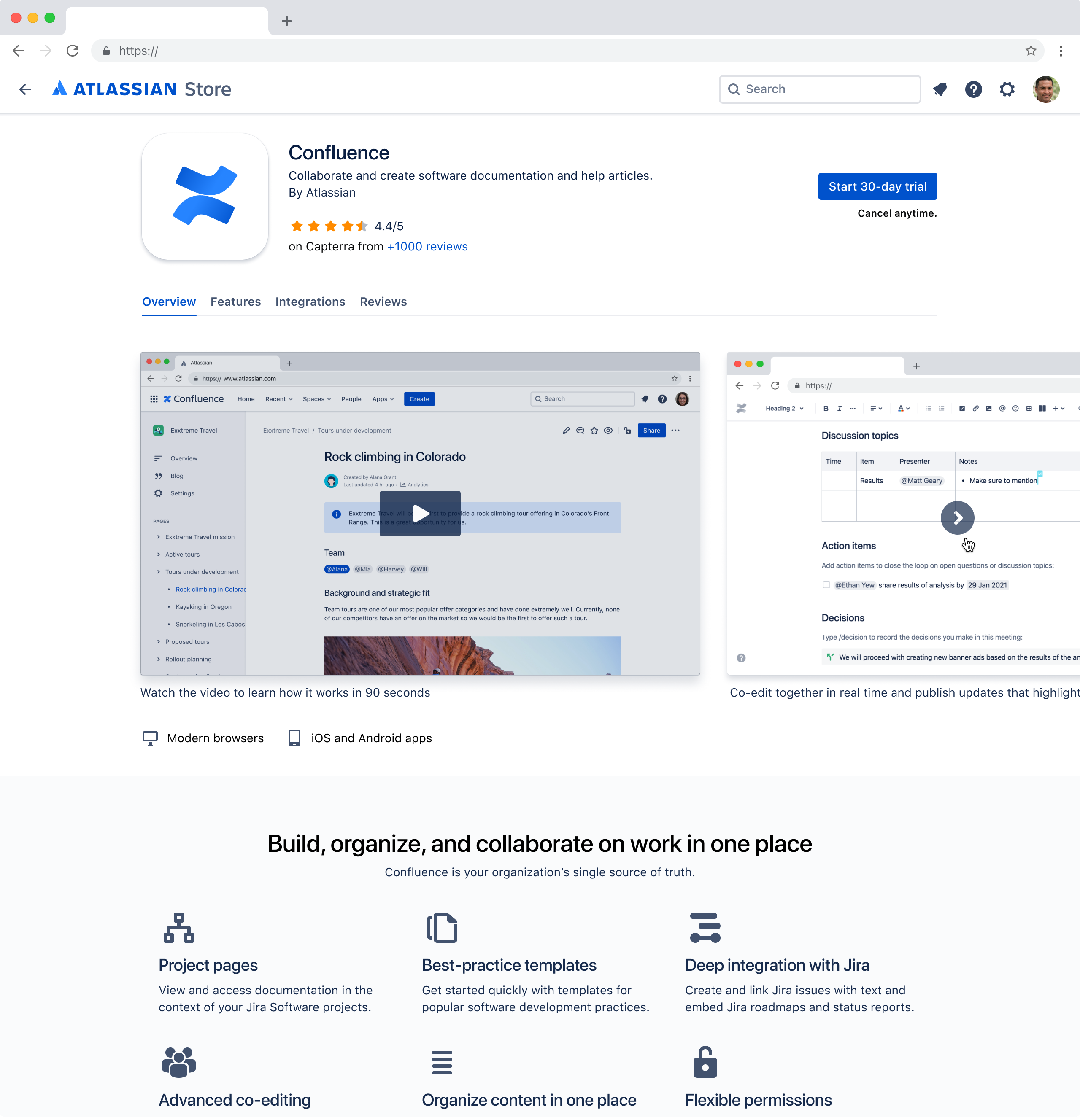
Decide in Product page
I want to understand what this tool is and how it will help me or my team
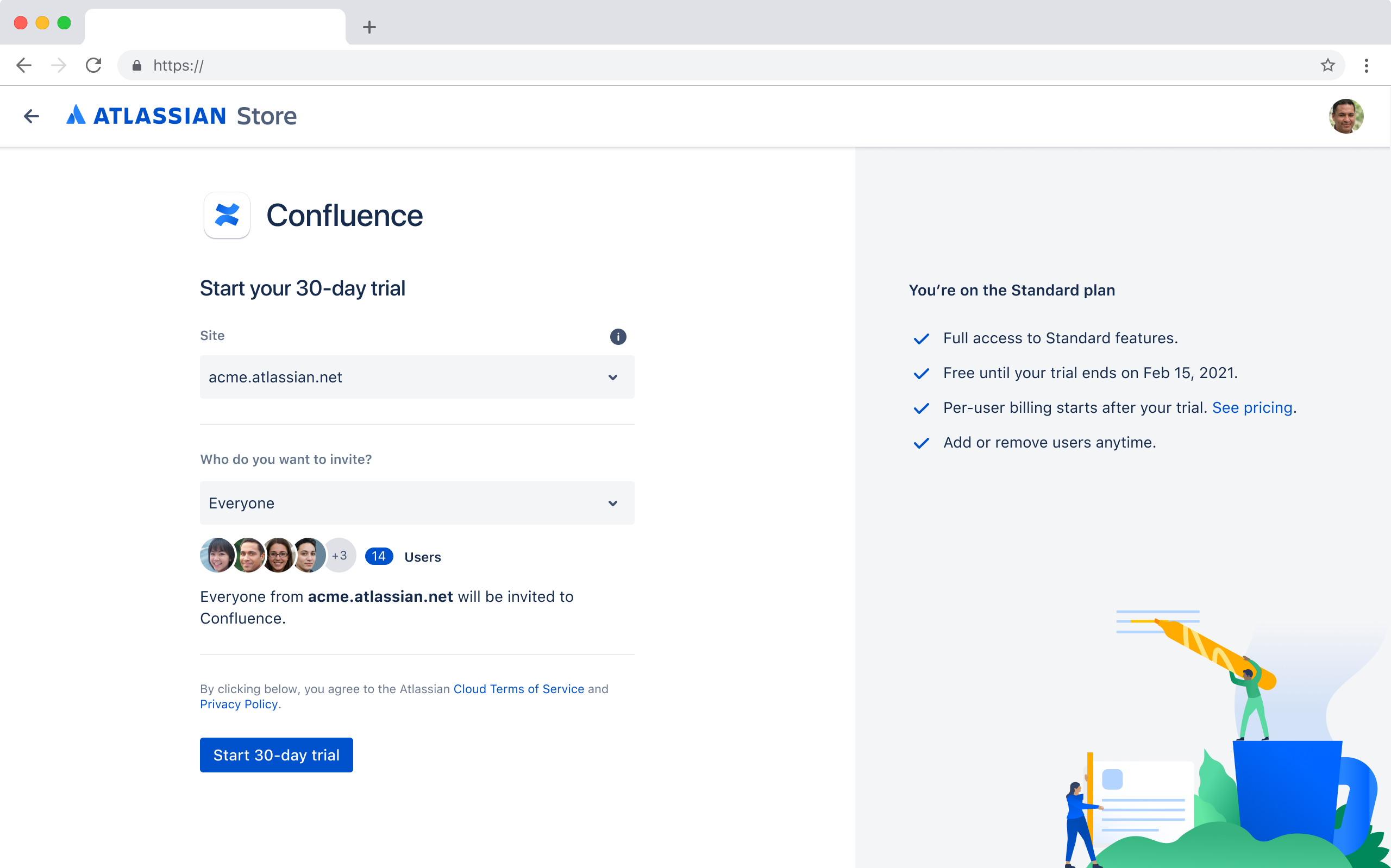
Get started in Sign-up page
Make it easy for me to sign up and try this tool.

Testing
We ran two rounds concept testing to help gauge the direction of work, understand the customer impact of our designs and whether it helps improve usage, comprehension, and confidence.
We wanted to find out if the proposed cross-flow designs improve our user's comprehension and perceived value of our products, thus increase the likelihood that they will sign up to our products? We also wanted to understand what confuses and what delights them?
What we wanted to learn
- Do use-case driven categories enable users to find tools that meet their needs?
- Are users able to understand our products and their value?
- Do the new designs increase desirability of our products? And why?
- Do the new designs increase usability? And how?
- Do we reduce the barriers and friction caused by the current experience? And how?
- Task completion and satisfaction
Method
What
Testing prototype of cross-flow funnel experience from JSW to Confluence
Users to fillout a survey to capture emotional impact
Who
6 to 8 users to ensure we reach statistical significance
A mix with Jira only, as well as Jira and Confluence users
How
60 min 1:1 moderated testing
Participants include: moderator, notetaker, and participant.
Synthesis
We synthesised the findings by extracting information using shorthand notetaking techniques to highlight: observations, issues, positive findings, inferences, quotes. We completed a debrief to dicuss top takeaways thereafter. All of these notes were then categorised based on the area that they affected, from navigation to content.
Findings
We summarised all the findings from the mural board into a couple of different formats: a presentation for quick and easy disgest, a confluence page for deatiled analysis, and a video of the presentation to ensure stakeholders could consume the information in their preferred way.


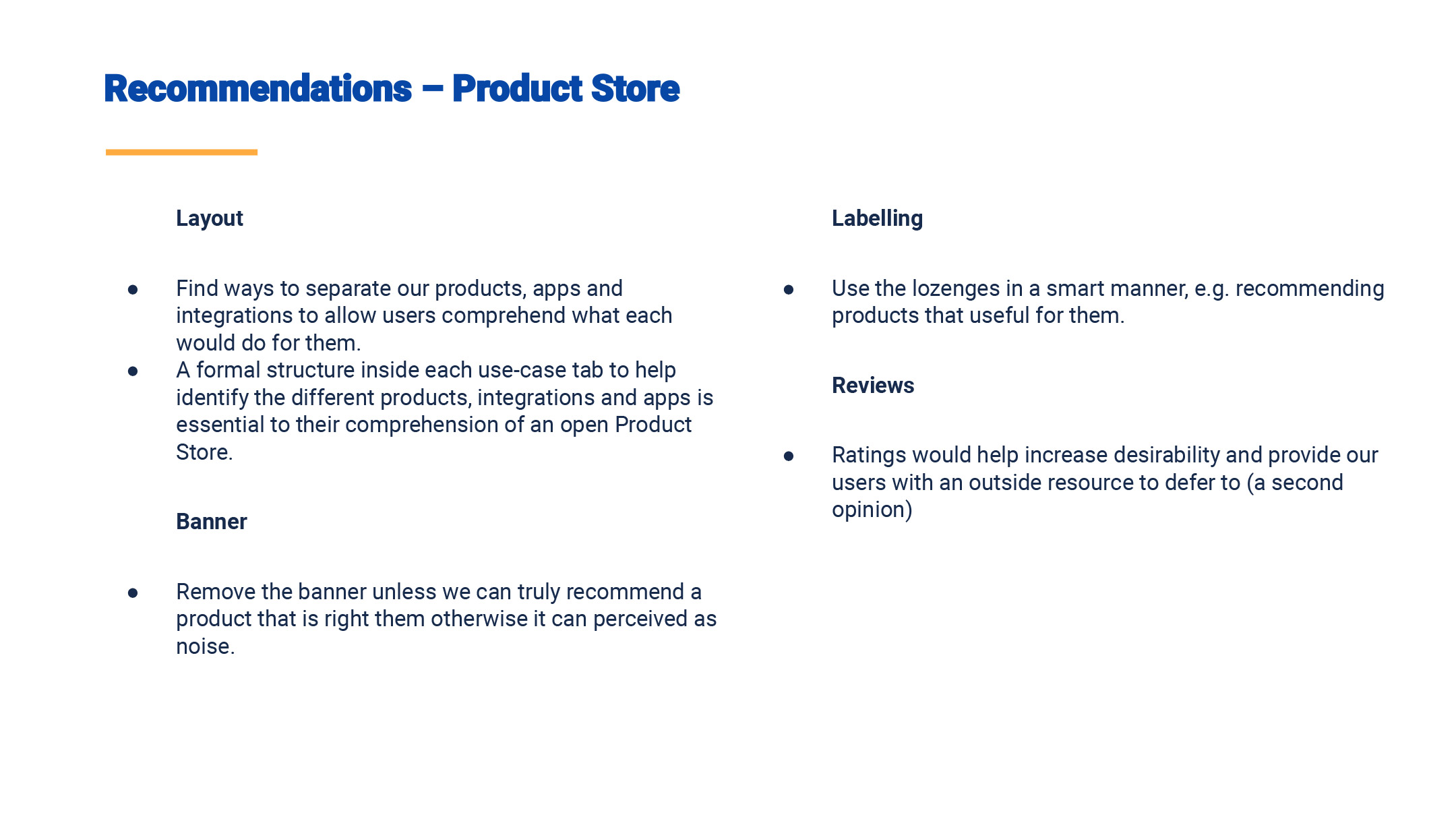


Hi-fi Design
During this phase, we wanted to ensure we build robust and system-thinking designs. What does this mean? We wanted to run through the different scenarios (outside of a happy path), edge cases, design specifications, and how the designs could across different products.
Scale
We wanted our store to be designed with scale in mind – I thought of it like a camera lens. Our general store is set to f22 with everything in focus. As we narrow down our aperture ring we’re putting more emphasis on the location and job story.

f22 – Everything
General store
Providing users with tools across multiple use-cases
"Help me discover tools across a range of different use-cases within the Atlassian ecosystem"

f8 – Focusing on specifics
Product-centric
Providing users with tools for a specific product
"Help me disover tools for {product} across a range of use-cases"
f2 – Focusing on single use
Single use-case
Providing users with tools for a specific problem
"Help me find a tool to resolve a specific problem"
System-thinking
We looked how this concept could work across different scenarios to make sure we have it has a system-level understanding.

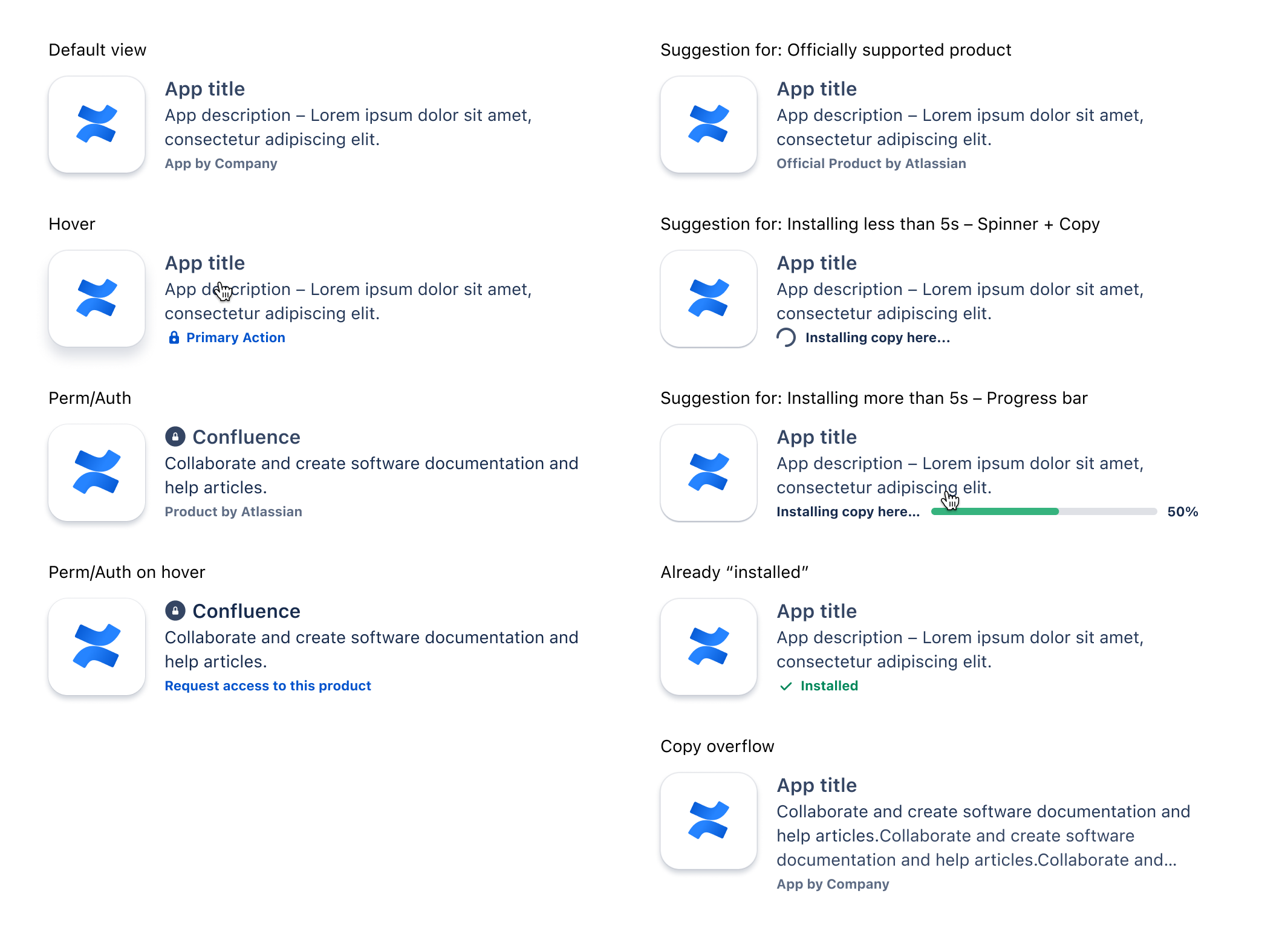
Interactions
We’ve also started looking at the app tile interactions and how this could work across different states and within different products.
Content Design
We designed the content around the purpose and meaning behind each section. Then we looked at which components would fit that purpose.

Deliver
As we moved towards building the designs that into real-world experiments. It was important to keep the engineers in loops during the whole process, via slack, confluence updates, loom videos and involving them in as many of the workshops. This made sure that we not only built a north-star vision for the cross-flow funnel but do it in a realistic and managble way.

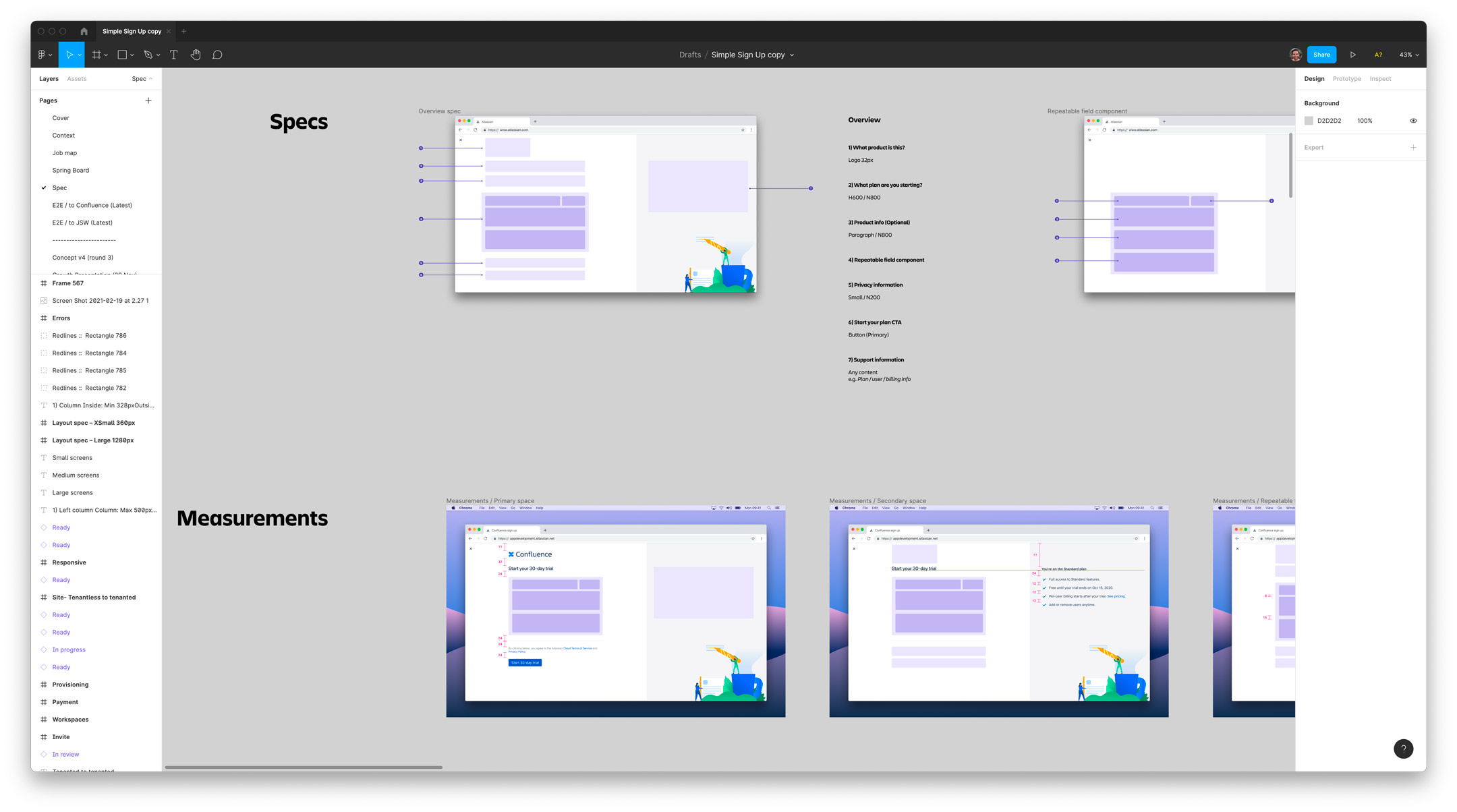
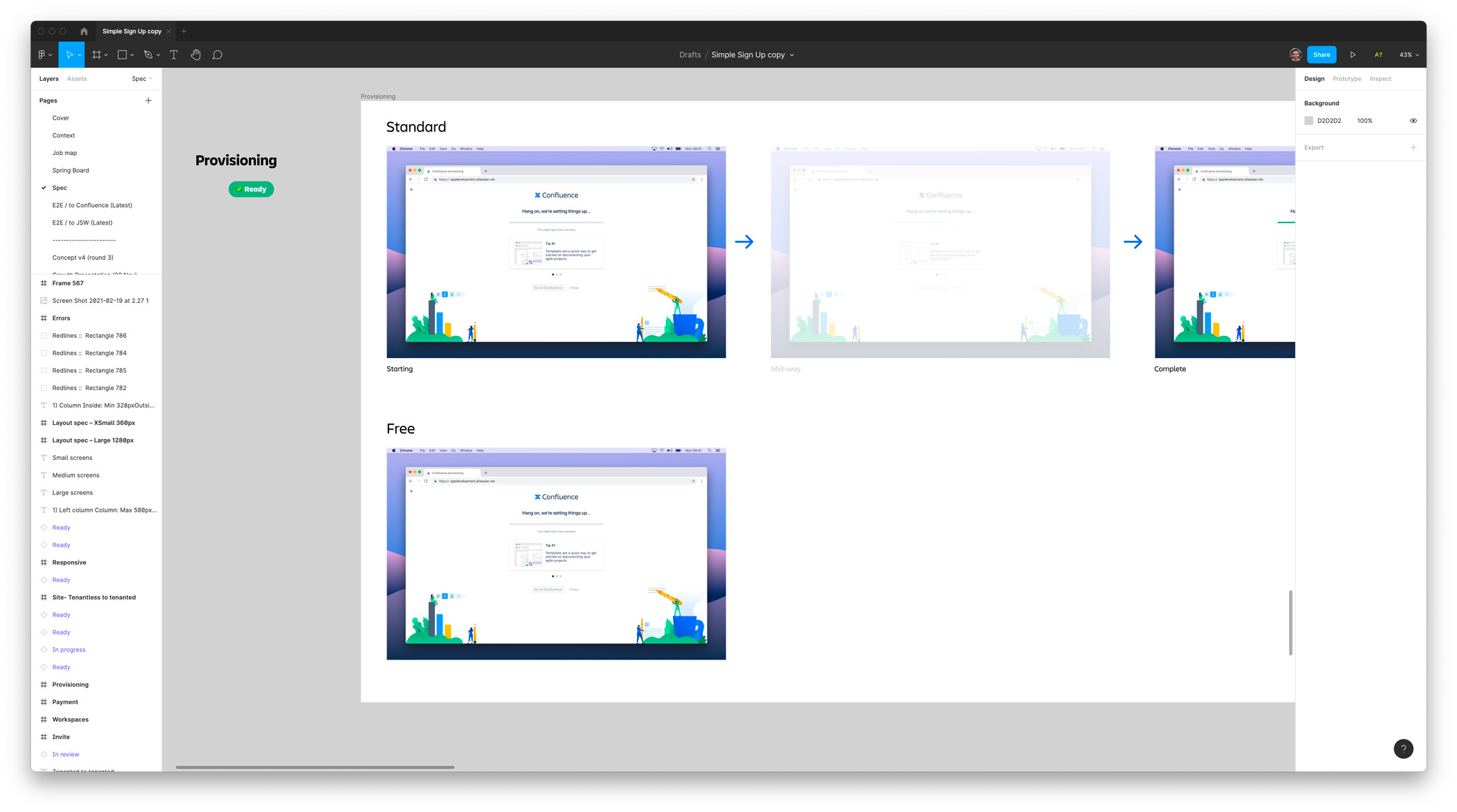
We had detailed feasibility sessions with the engineers to look unpicking scenarios, components, and interactions to be able to spike them. We also built spec sheets that outlined different scenarios, edge cases, breakpoints, and detailed interactions of components.
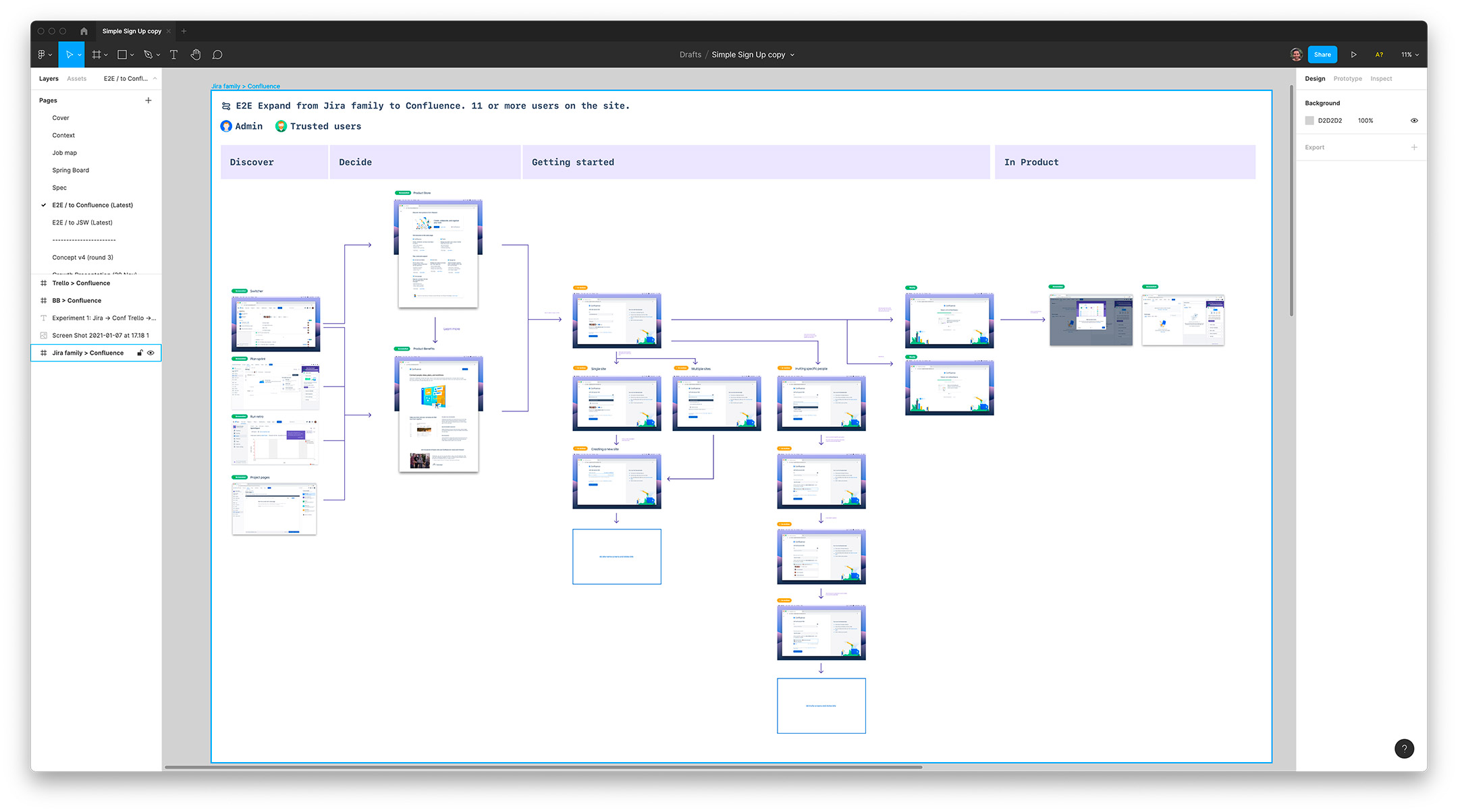
It was important for us to build out detailed end-to-end journeys of the hi-fi designs so that we could ensure we had a complete picture of all the use-cases. One of the final parts was to create a design QA document (similar to UAT), which involved putting together user stories, hi-fi designs, and screenshots of the built designs to make sure we had design and functionality parity.


About
Team size
1 Designer (me)
1 Product Manager
1 Engineer Manager
5 Engineers
1 Analyst
Role
Design Lead
Researcher
UX and UI
Software
Figma
Mural