About this project
15
different design concepts
12+
stakeholder meetings
1
live prototype
Impact
Redesigned Transport for London’s digital screens across 257 stations, improving clarity, accessibility, and adaptability, enhancing commuter experience, reducing staff reliance, and earning praise for its modern, intuitive, user-centered design.
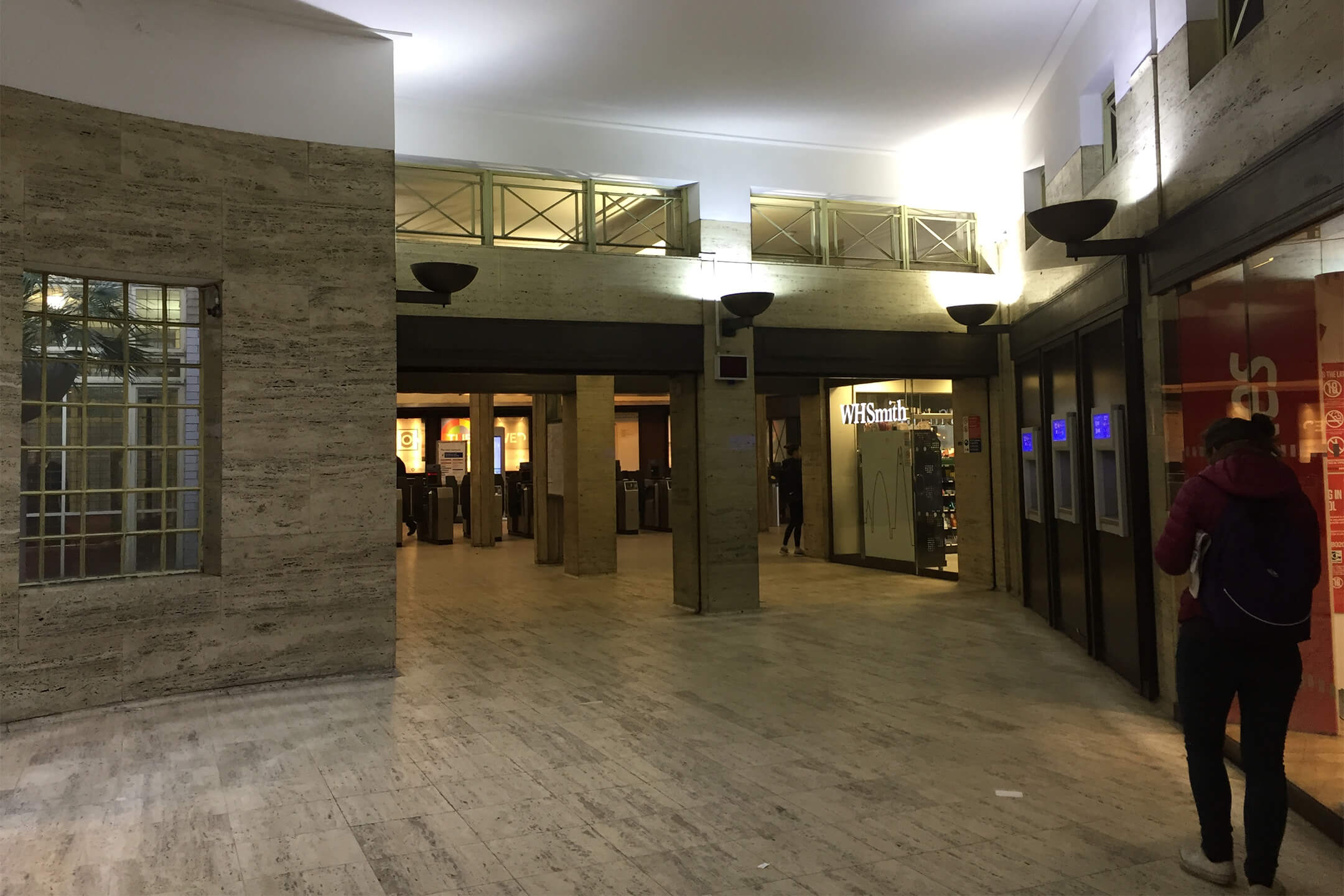
No other city is as recognised by its transport system as London. Its red buses, black cabs and Tube trains are known the world over.
Transport for London
Transport for London is a local government body responsible for most of the transport network in London. TfL operates many transport services including: the London Underground, London Buses, Docklands Light Railway, London Overground, TfL Rail, London Trams, London River Services, London Dial-a-Ride, Victoria Coach Station, Santander Cycles and the Emirates Air Line.
Almost 1.35 billion passenger journeys are made on the tube every year. More than 31 million journeys were made in London on average.

Product
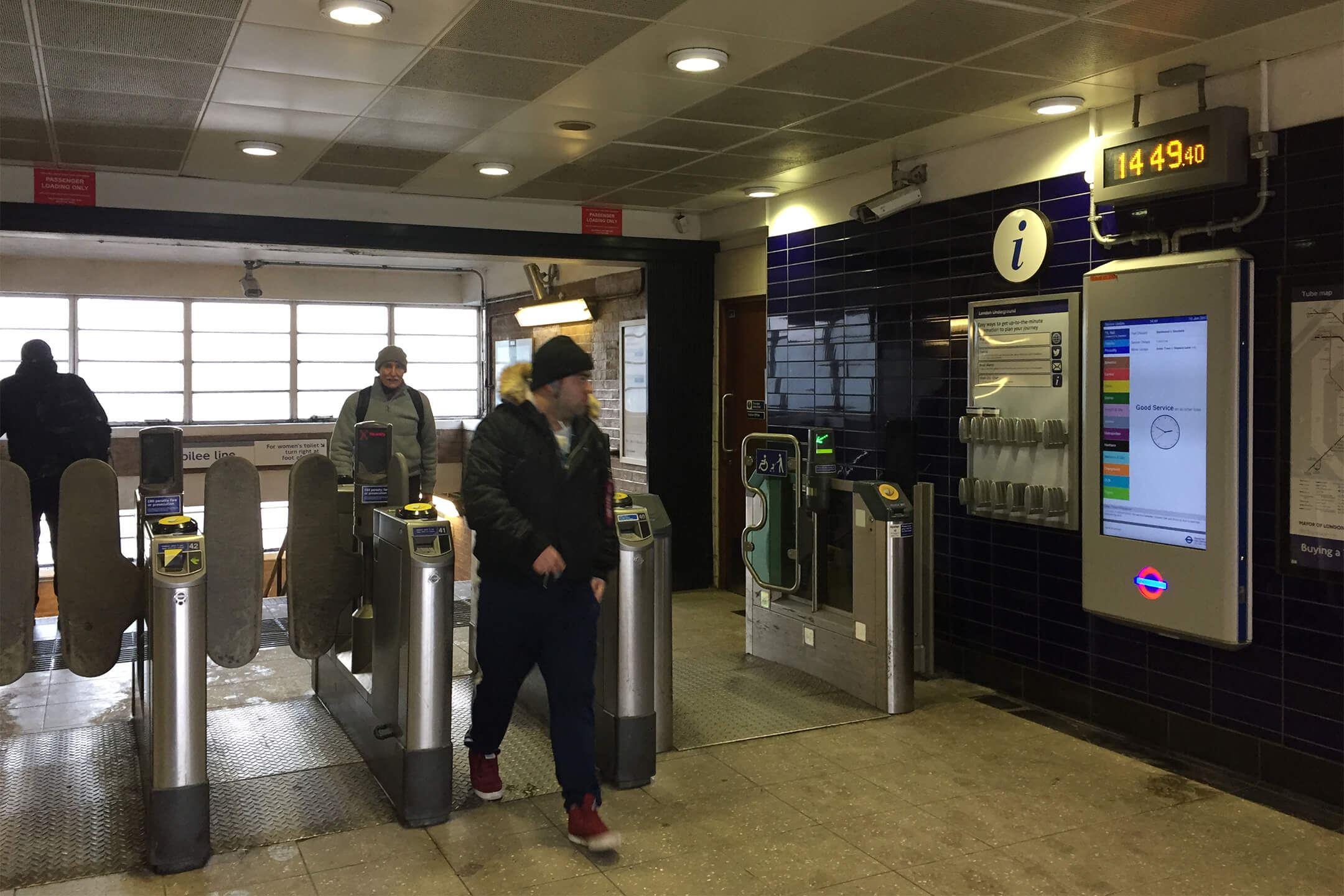
Digital screens – they are everywhere now. TfL wanted to make using these screens easier to read and understand allowing customers to make vital decisions quickly.
Currently, the screens are showing too much information on a growing network that needs a scalable system. The system needs to handle the pressures of issues affecting the tube network in a useful, simple and intelligent manner.
Problem
Customers are not able to effectively use the digital screens in the tube stations around London because the information isn’t localised and relevant, the design creates cognitive friction, and doesn’t allow give enough data for critical decision making.
An experience where data is helping users access information that makes wayfinding decisions easier all within in a couple of seconds.
Outcome
We developed a scalable, user-centered design system for Transport for London’s digital screens, enhancing clarity, accessibility, and adaptability across 257 stations by leveraging real-time data and extensive user research.
This has transformed the commuter experience by delivering actionable, accessible information, reducing operational strain on staff, and receiving widespread positive feedback for the modernized and intuitive interface.
The project has rolled out to all 257+ stations across London.
🚂 Here is how we did it 👇
Discovery & Definition
We gathered a lot of user research from previous studies conducted by TfL themselves to help us analyse former issues that could coincide with our own research.
We decided to talk to staff and commuters in a couple of different tube stations – I find that talking to the users you gather the important problems and sometimes the users also know what the solution might be. Using empathy mapping and journey mapping exercises to get inside the minds of the users and sketch all the opportunities and pain points to surface short and long term solutions.
Rhythm of the day
During the user research phrase, it was important to fully understand the ecosystem that we were designing for. This included time, location, scale, colour, and environment. The timeline helped us understand the different stress levels during a typical day on the Underground and how we could adapt the design to suit each phrase.

Understaing the scale of an issue
We created a quardant chart to help understand the magnititude of what could cause negative or positive feelings if a problem arose.

Physical technology
It was important to understand the physical and technological landscape, to better cope with any limitations both in hardware and software.

Cognitive research
I looked through a lot of research papers and studies to gain an understanding as to how users grasp current design patterns.
Memory load
A user can generally compute four chunks of information at one time.

Age and light
“At age 40, only half of the light gets through to the retina as it did at age 20. For 60-year-olds, it’s just 20%. “ The distance at which we can read letters is a common measure of legibility and reading speed. The greater the distance, the higher the overall legibility and comprehension are considered to be. The biggest factor determining how far this distance can increase is font size.

Contrast
A contrast ratio of at least 7:1 between the text and the background should exist. This will ensure the customers can read the information on the screen from at least 3 meters away and in different lighting conditions.

Copy
Studies showed that “concise, scannable and objective copywriting” improved usability by up to 100%. Finding the right tone and language is just as important as getting the UX and UI to work properly.

Design principles
We started off by comprising design principles to allow us to stay in touch with core values.
Actionable information
Quickly digestible
Reduce information dissonance
Demonstrably live

Localised information
Adaptive design system
British road signs
The British road signs project immediately came to mind. Both projects have a lot in common: the users need to be able to decide about the direction of travel with only a couple of seconds to decide while travelling. I then undertook further research on Jock Kinneir and Margaret Calvert’s design philosophy.
Their design system was based on the concept of using clean and legible type with well-formed pictograms (part iconic, part alphabetic and part symbolic). They found that using sentence case was more legible than the conventional uppercase lettering. They also ran usability tests to determine which font sizes worked most effectively.
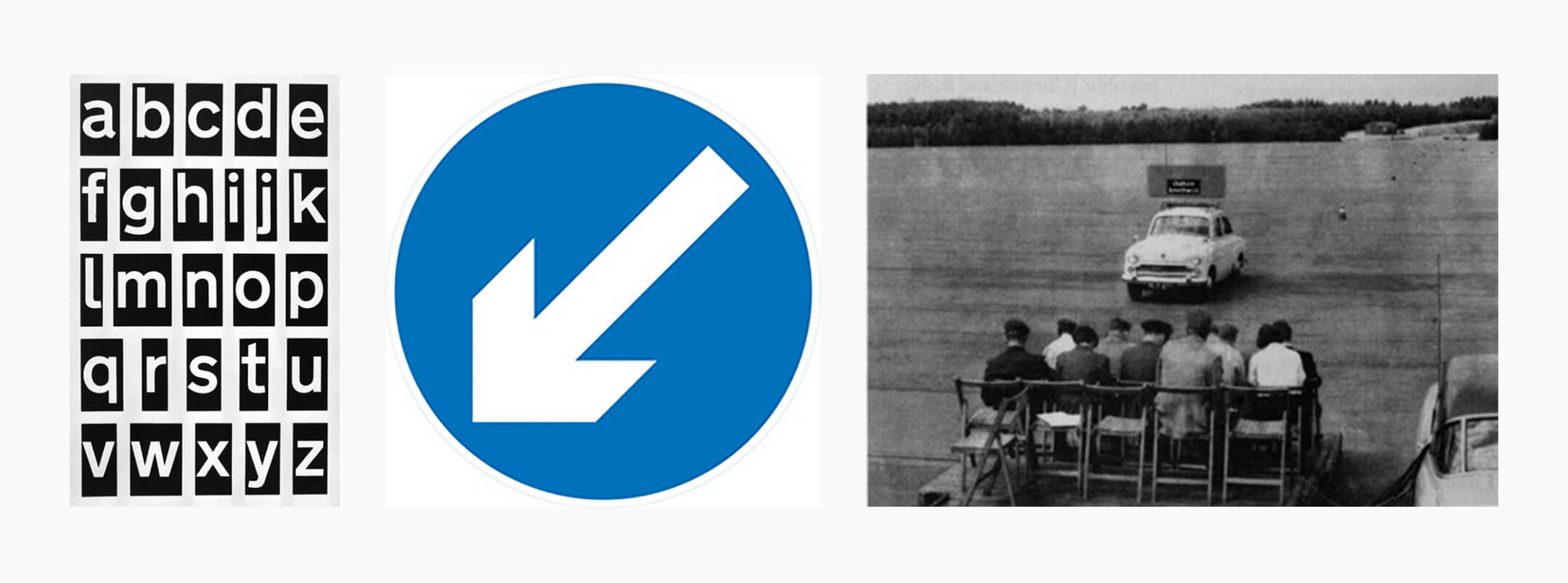
They used shapes for different types of identification signs.

Design
Wireframes helped us see the potential solutions and how they could resolve some of the short-term pain points.
Design system
At this point, we started looking into how we can use the print design language to help us create a design system, that would help embody TfL's print standard into the digital world.
Base number
The base number is a starting point for practical usage within the visual language. I used the TfL’s viewing distance guidelines in their Design standards documents. This helped give me a starting point of 10mm font height at 3m viewing distance. I then correlated that into a digital size of 42pt.

Modular scale
We wanted to use modular scale to create a set of numbers that are derived from the base number, TfL's logo, and the aspect ratio we were designing for. Those numbers now shared an innate and harmonic relationship.

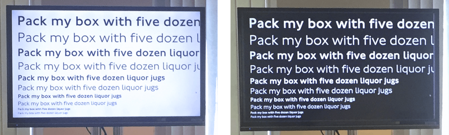
Font sizes
Once we had a ratio of numbers, we started to experiment with different sizes to test the legibility of TfL’s font. Black text on a white background and white text on a black background was used, to see how the font rendered in various situations.
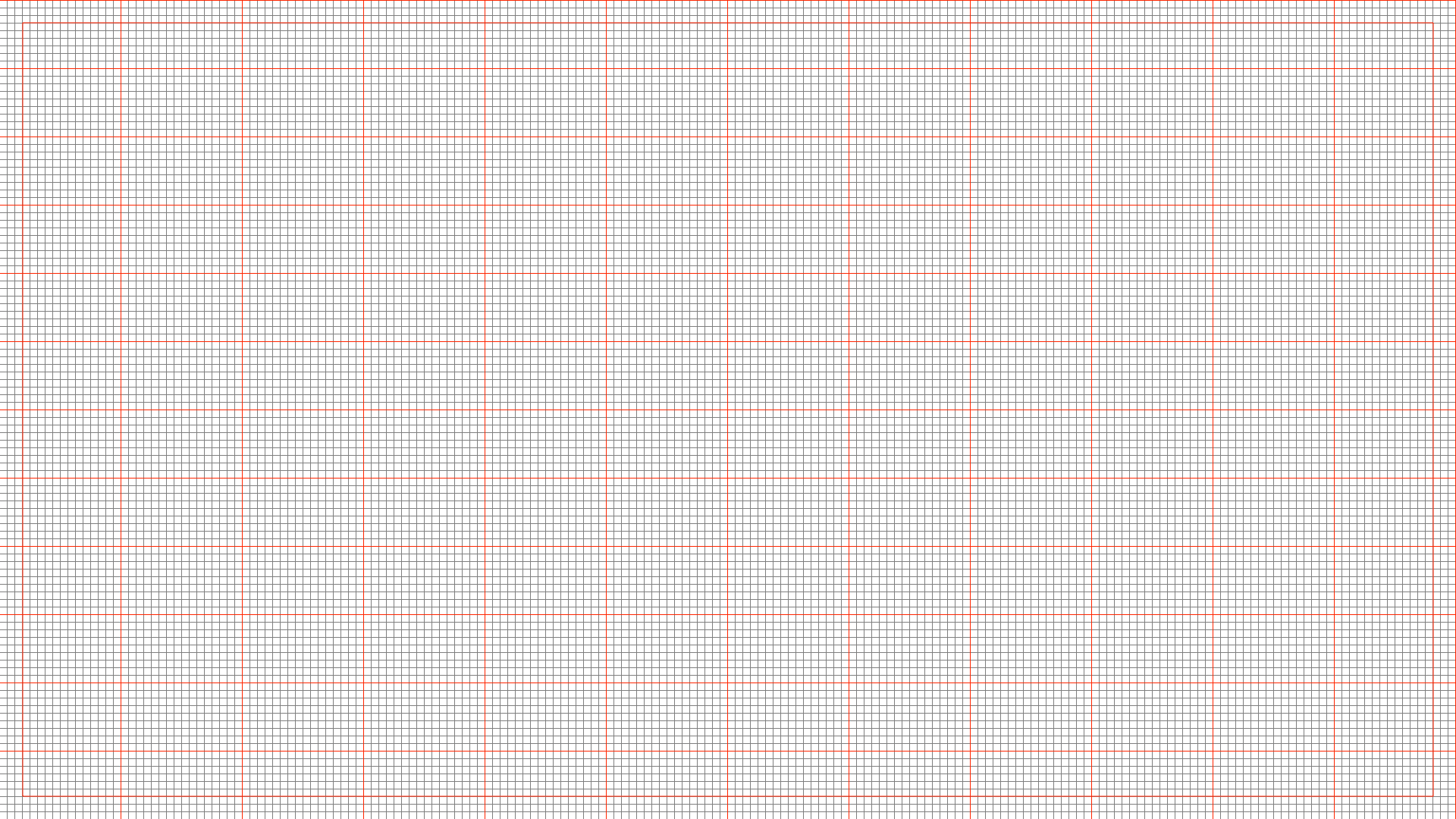
Grid system
We used a 10x10 grid system to help us to scale across multiple devices and situations.
Card design
Card design is great analogy to describe how to componentise design in a tangible and relatable form.
Why is card design useful? We found them good for: chunking content, making data/information easy to digest, it makes information visually pleasing, and they are good for varying screen sizes.

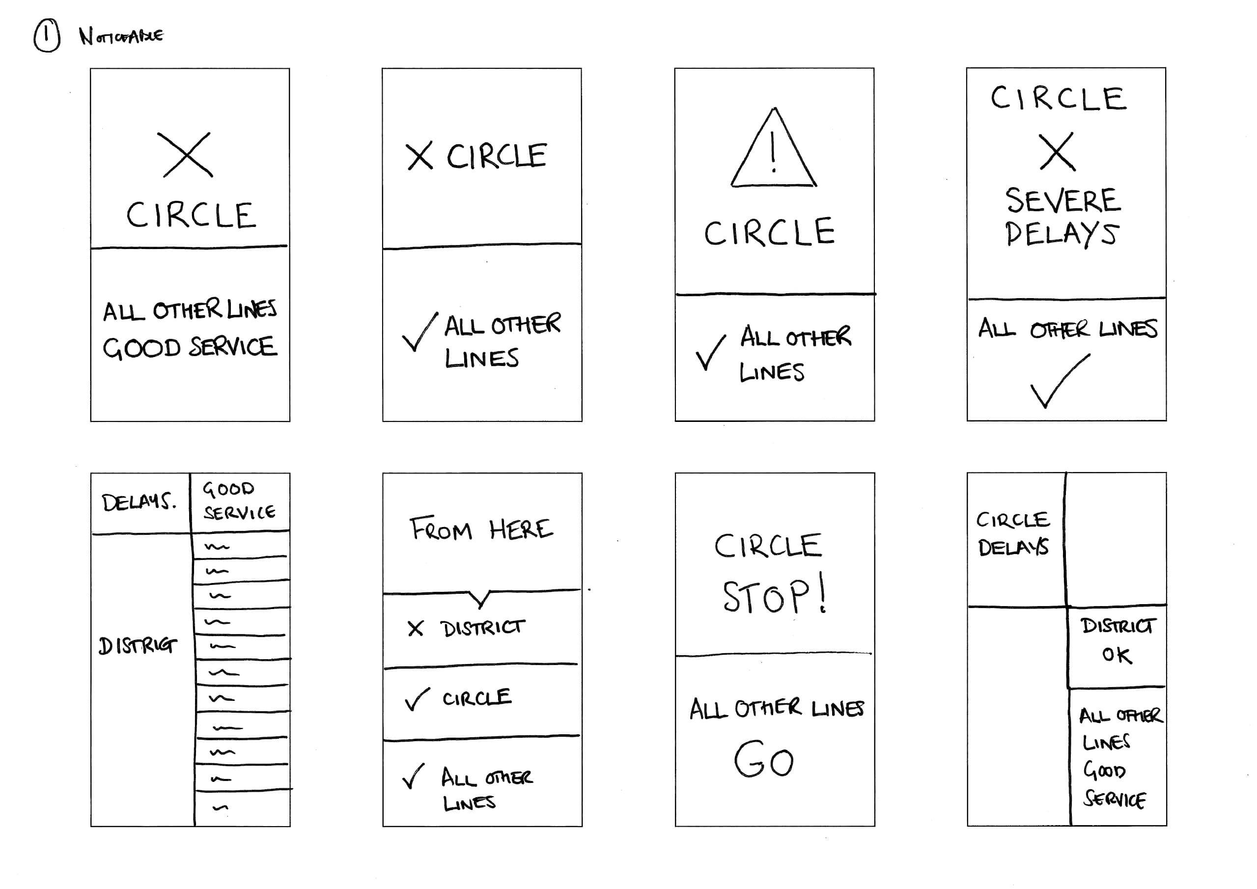
Concepts & Testing
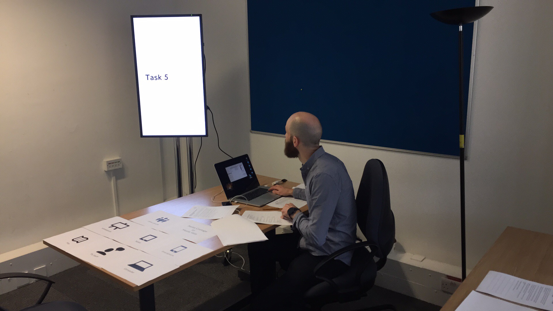
We went through at least 10 different concepts and I won't show you all of them. But we got to one final version with various iterations of that, which went into concept testing. We focused on testing with a range of age groups, gender commuter-type and location to ensure an inclusion approach was taken.
We learnt a lot from concept testing as it ensured we were moving in the right direction with confidence.
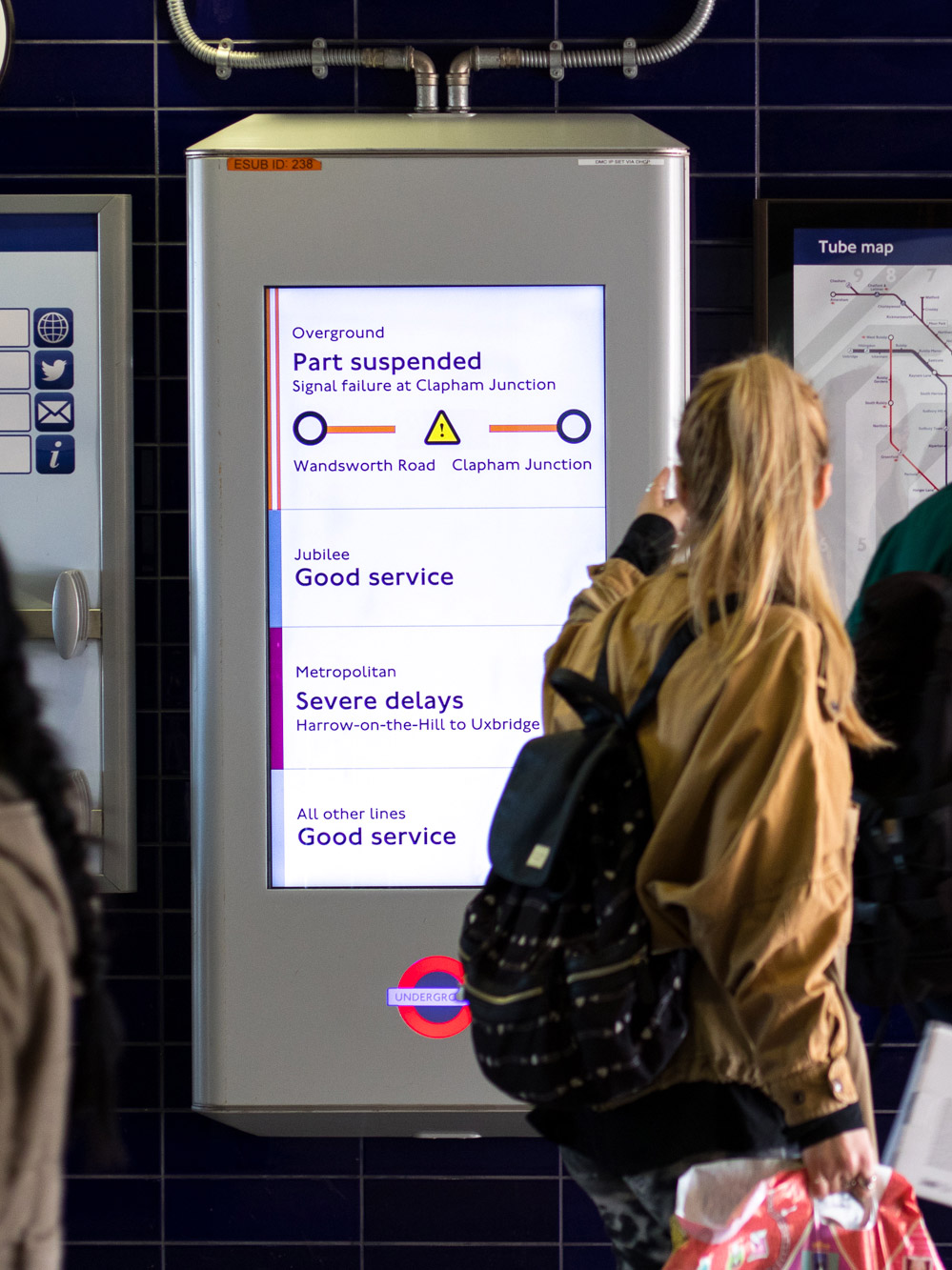
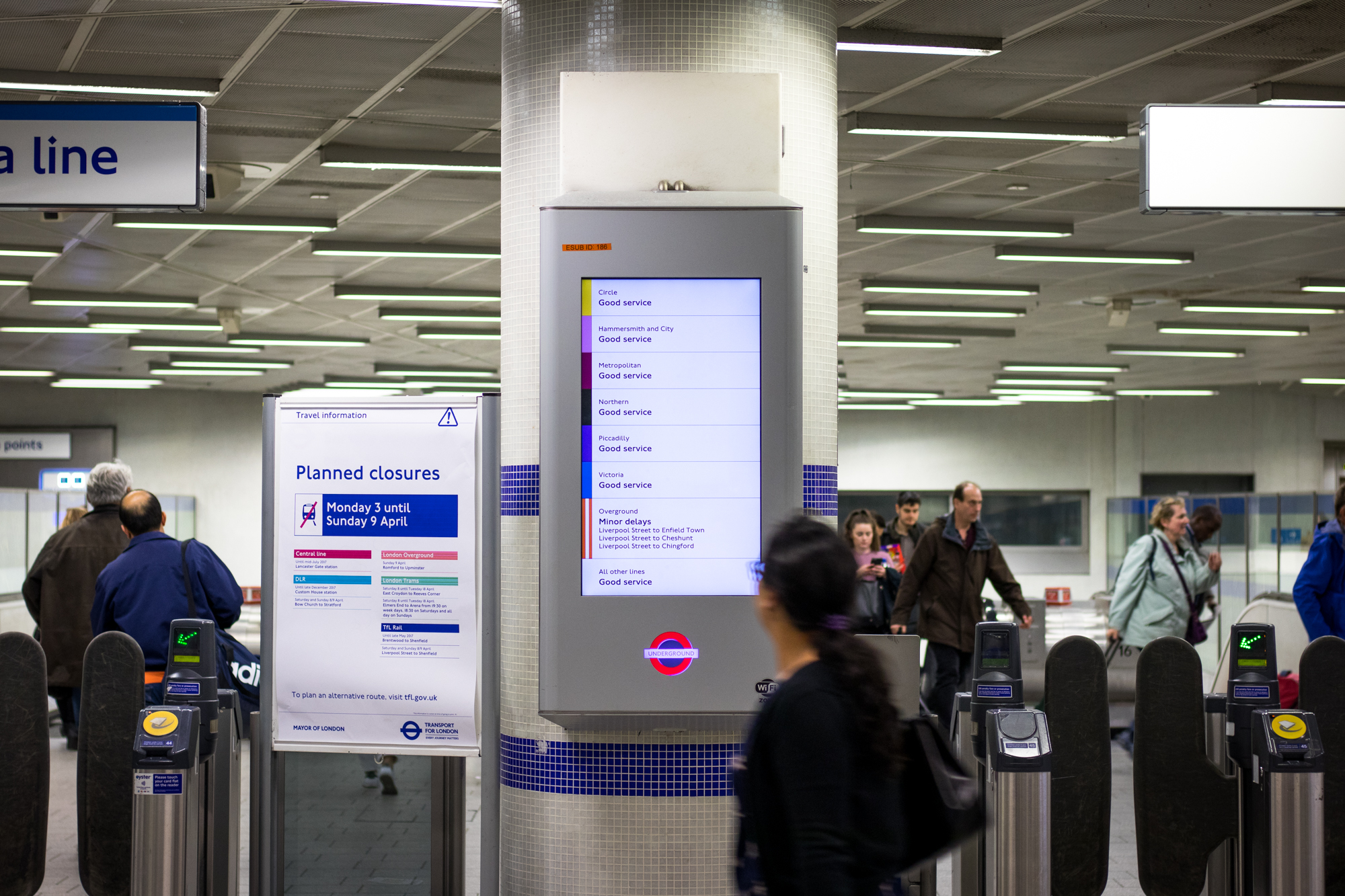
Let's take a look how where we were and where we came to. Imagine you’re at Victoria station and you walk into the station and see this new digital screen interface appear as you walk near the ticket barriers.
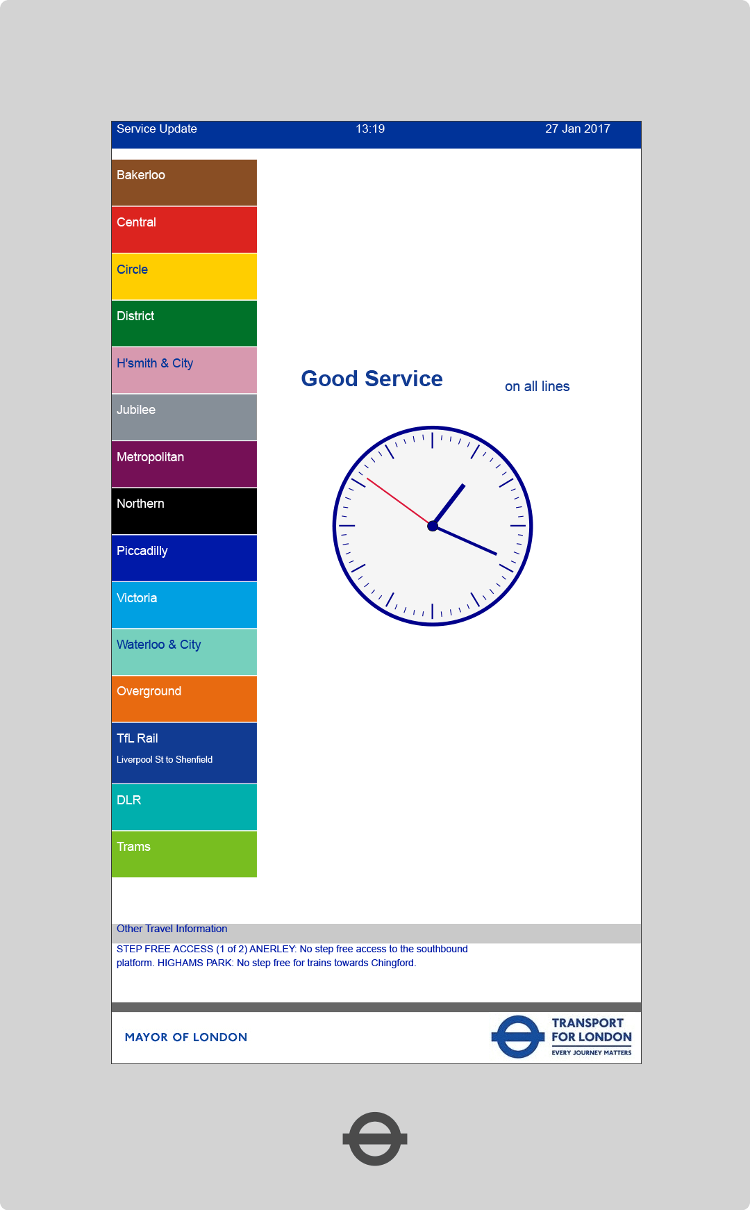
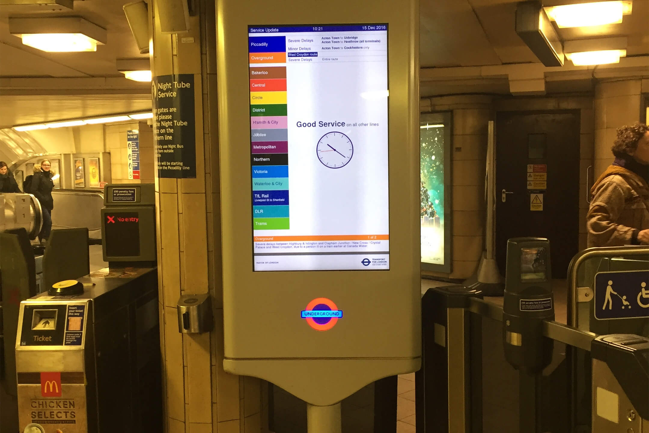
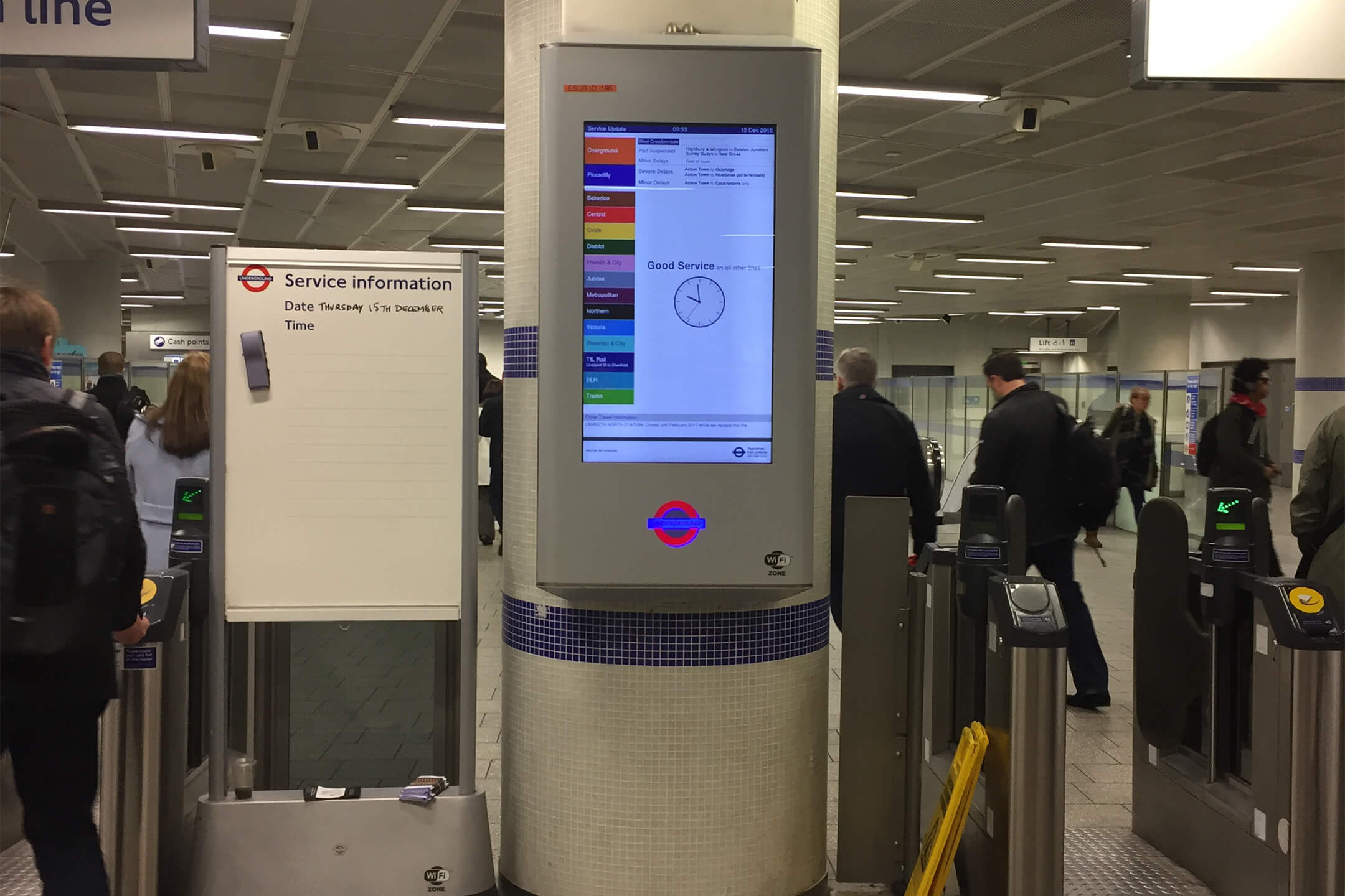
Before
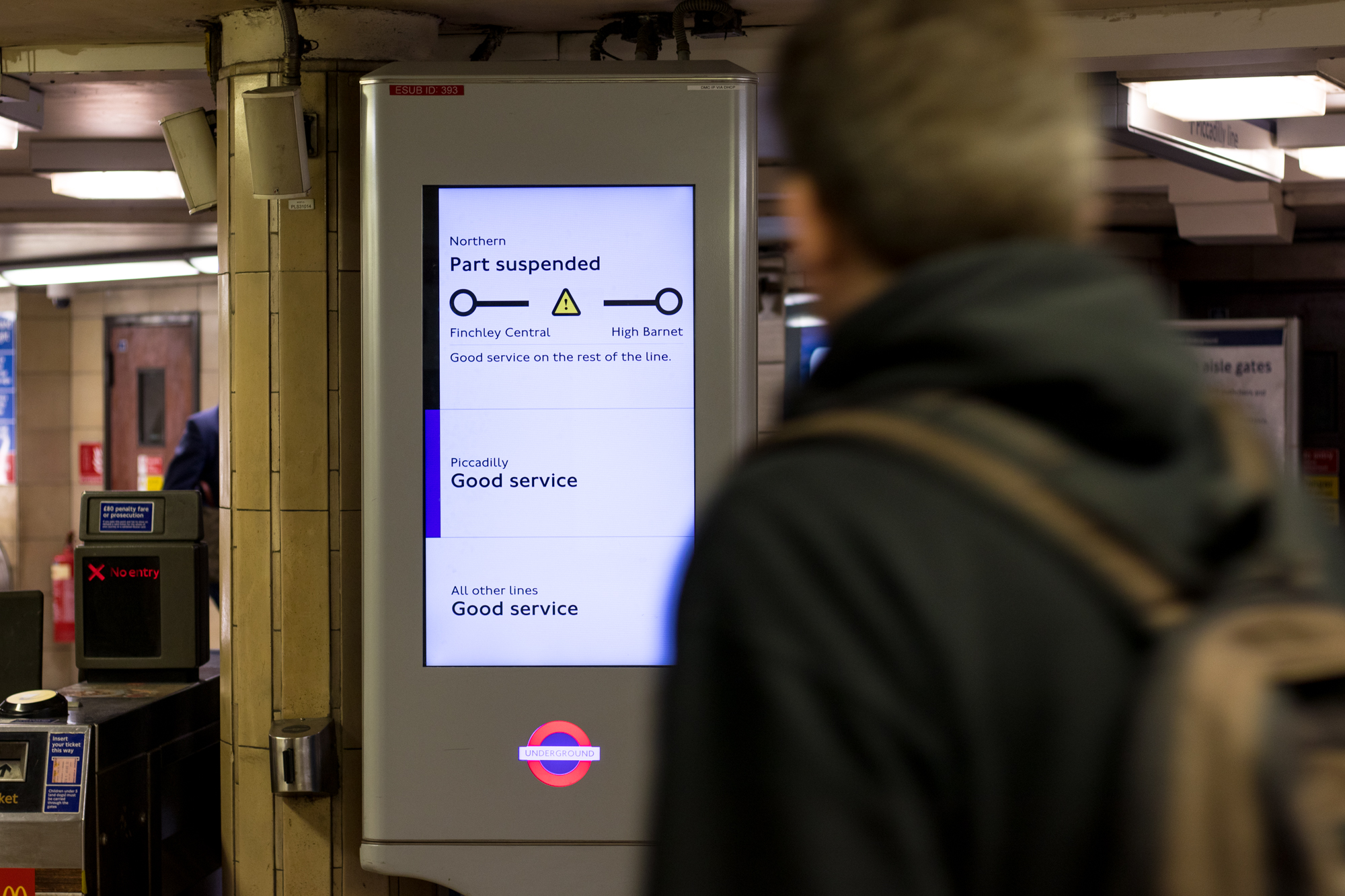
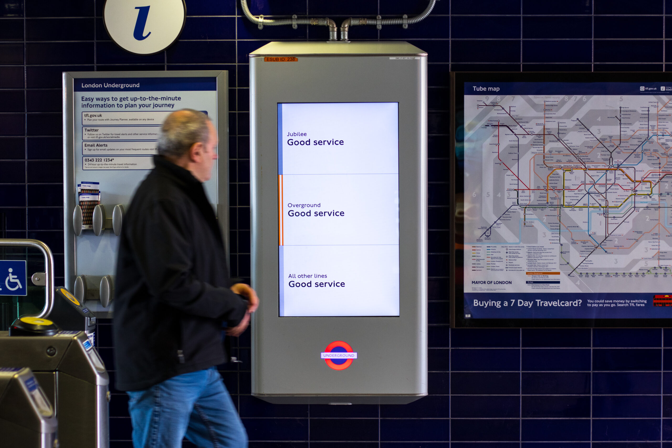
The current interface has issues with legibility, scalability and information hierarchy as well as localisation.
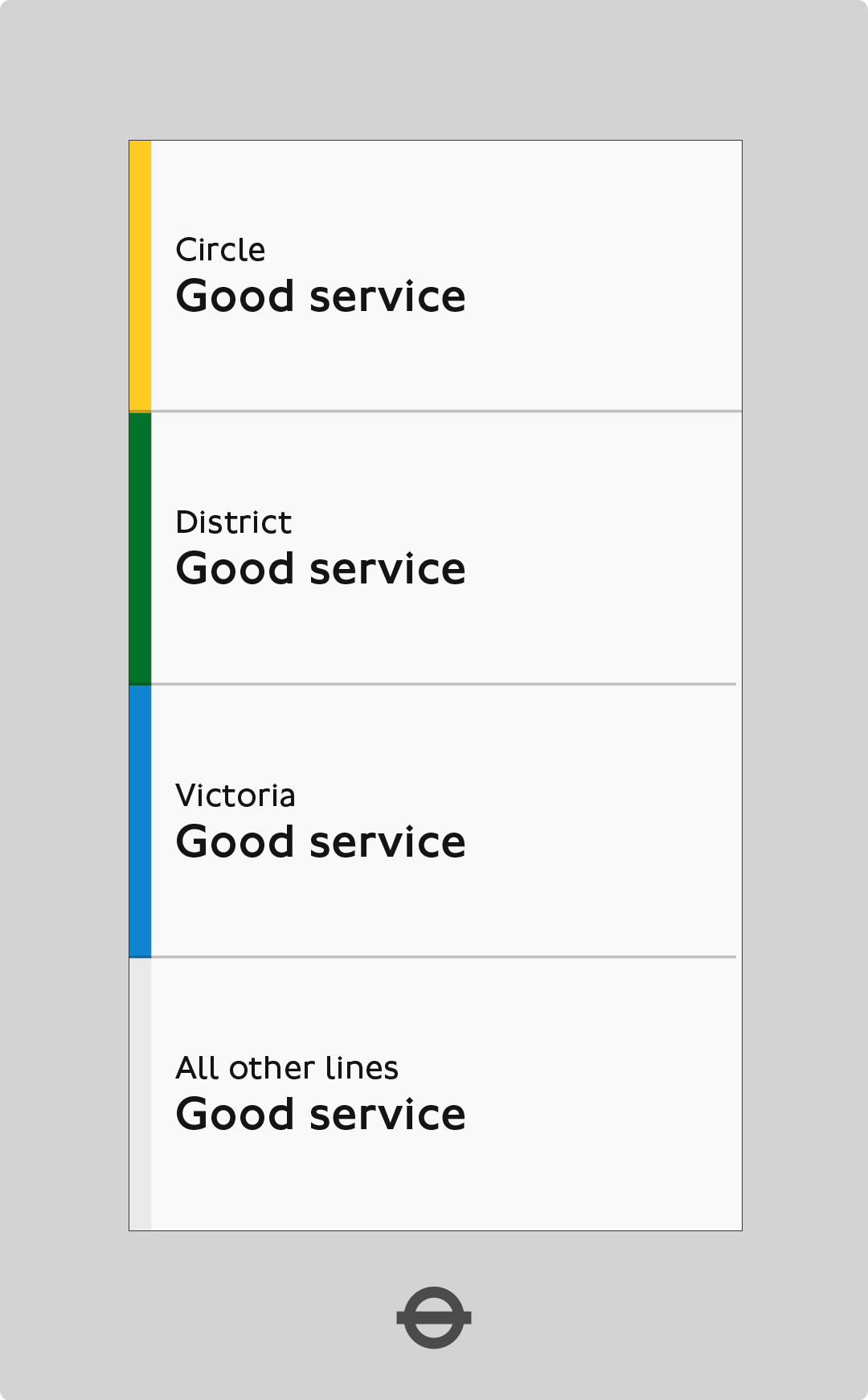
After
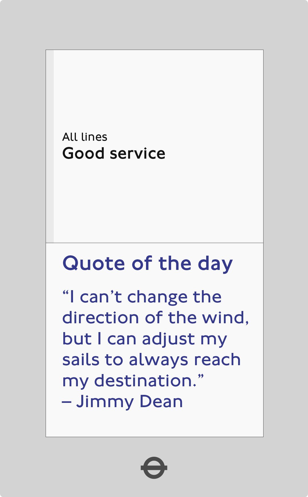
Clean, concise, and legible. Localised lines provide commuters with line information that is relevant to their journey whether it is initial or on going.
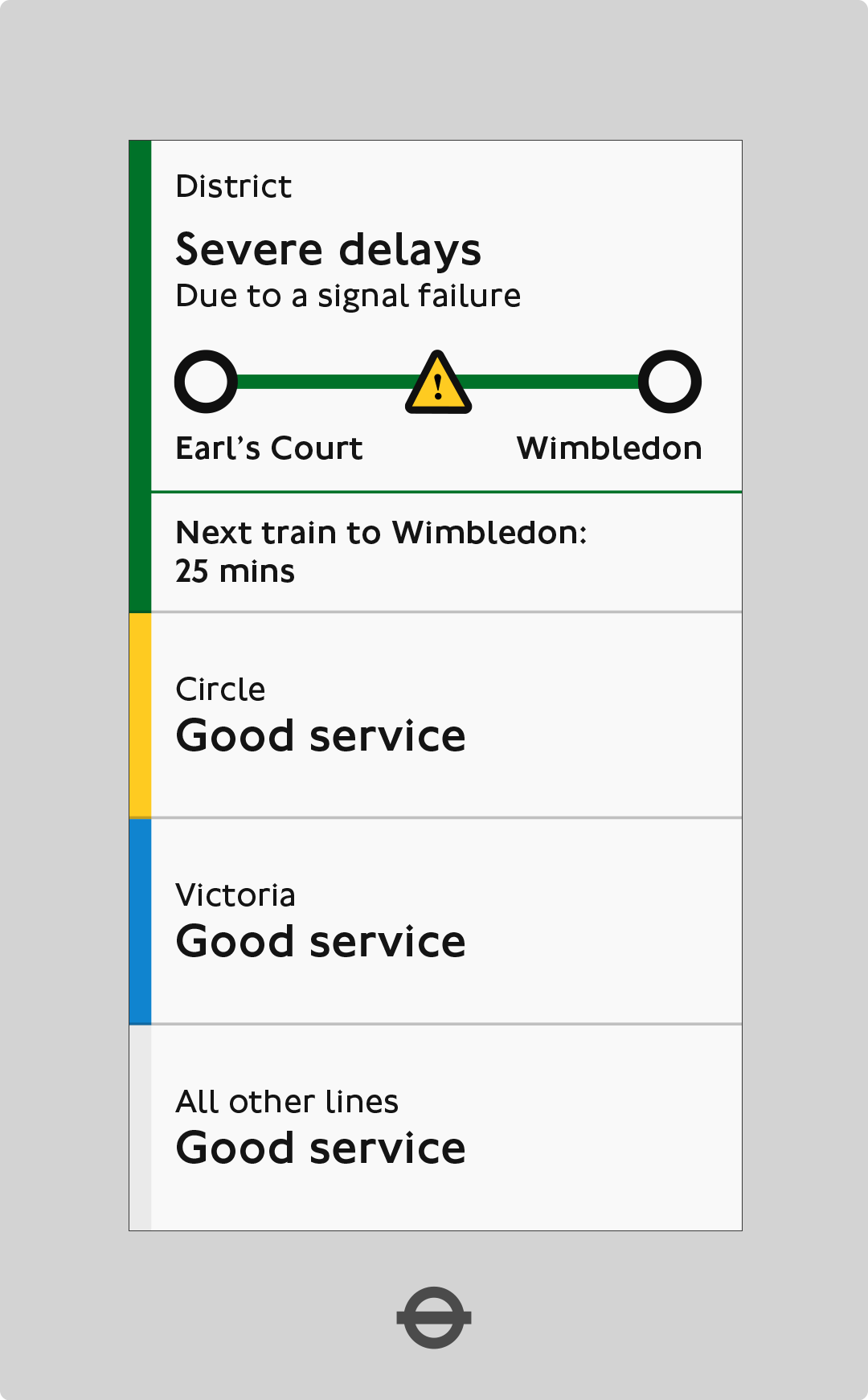
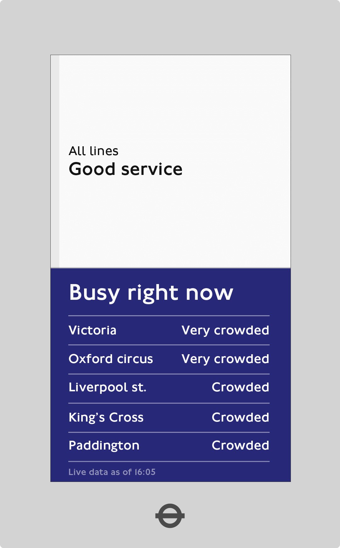
Delays
Using graphics to highlight issues on the local lines – providing the commuters with visual hierarchy through position, typography and iconography.
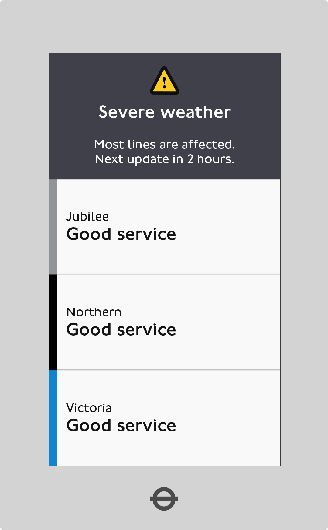
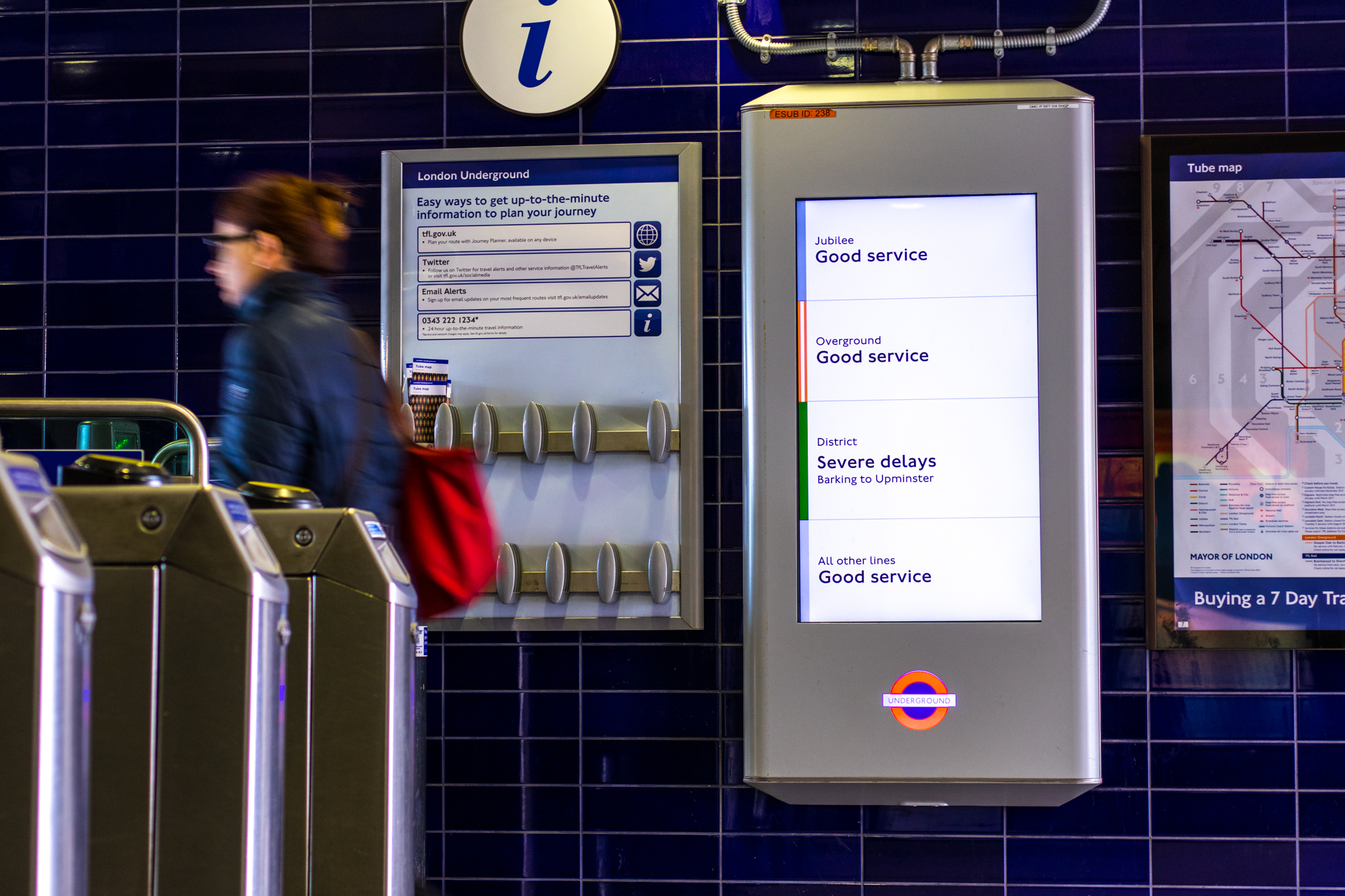
Entire network delays
The interface is inverted during major disruptions, showing what is working and a brief message.
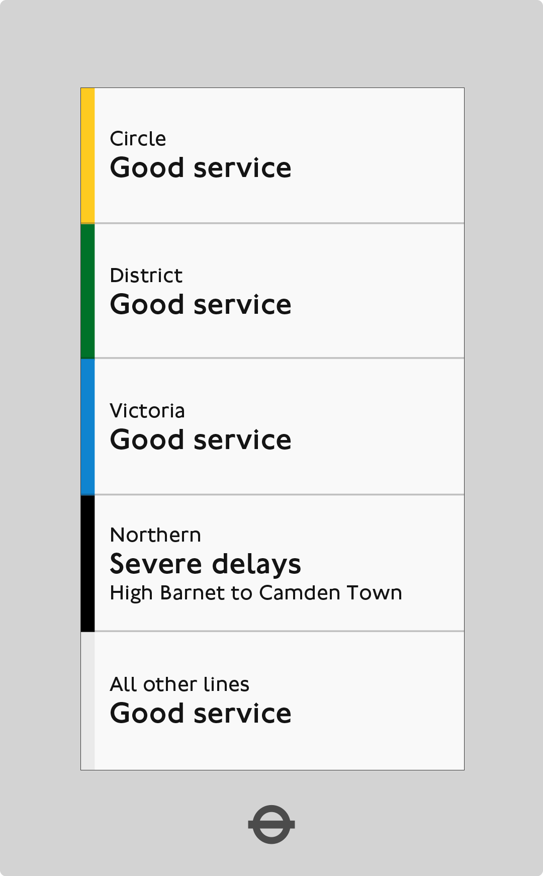
Non-local delays
Delays to non-local lines are degraded to keep the visual hierarchy localised.
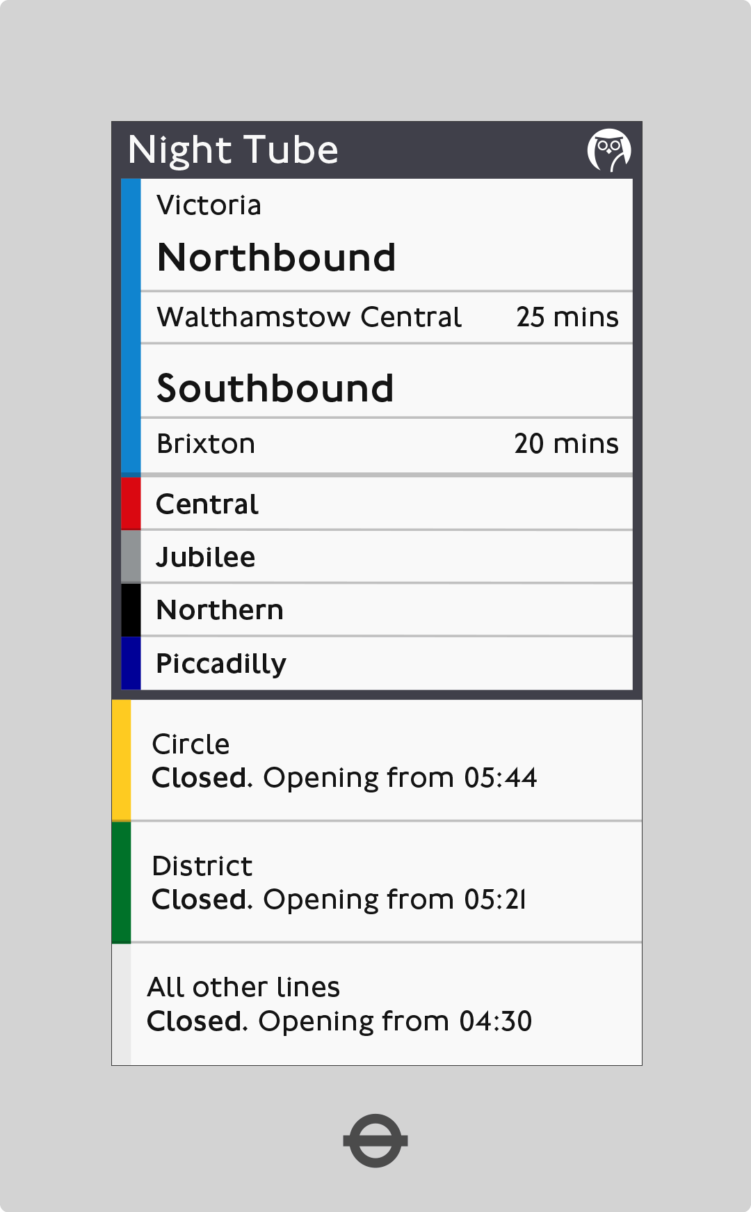
Night Tubes
Localised Night Tube information is shown while other Night Tube lines remain on the screen to allow for a learning phase.
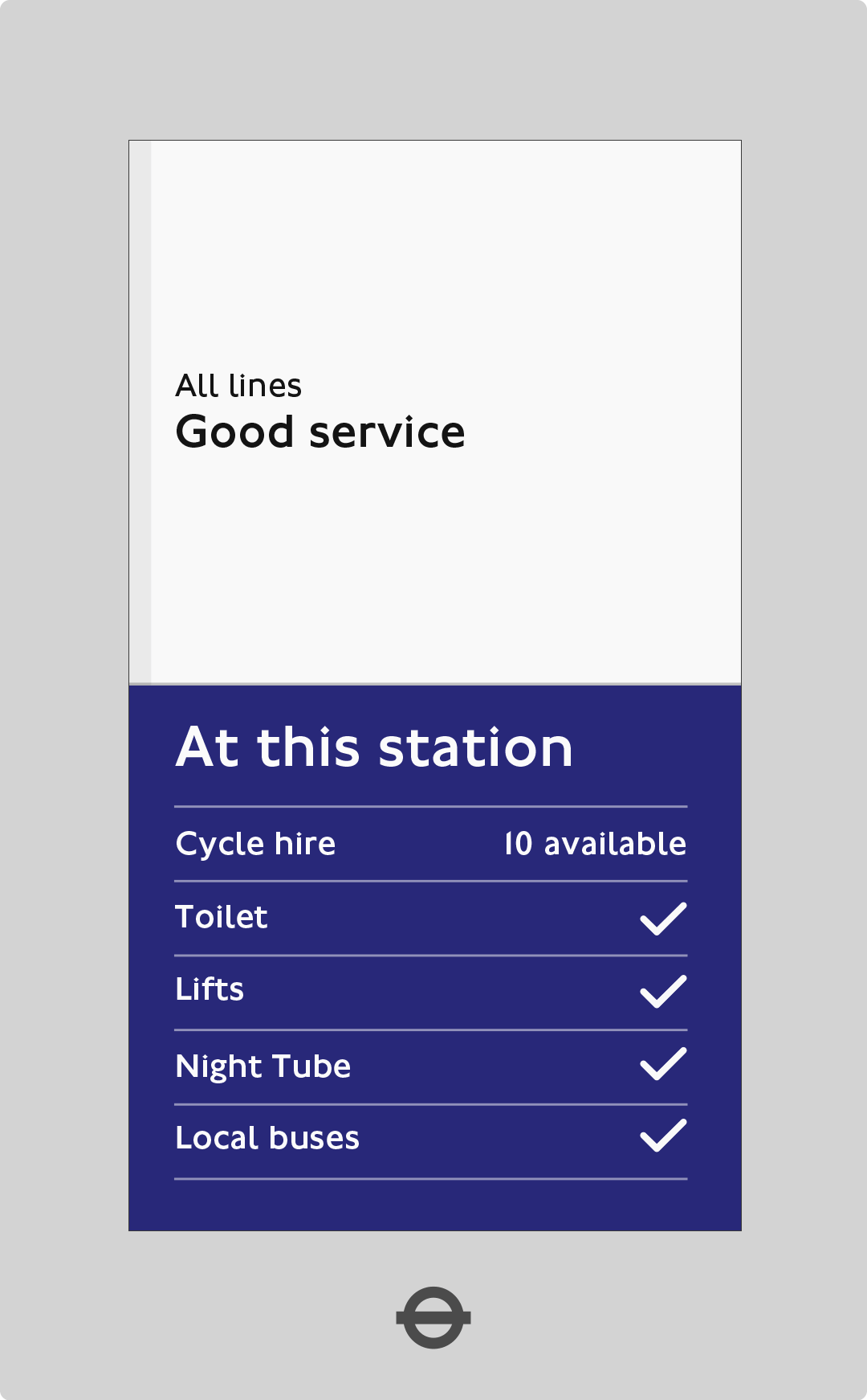
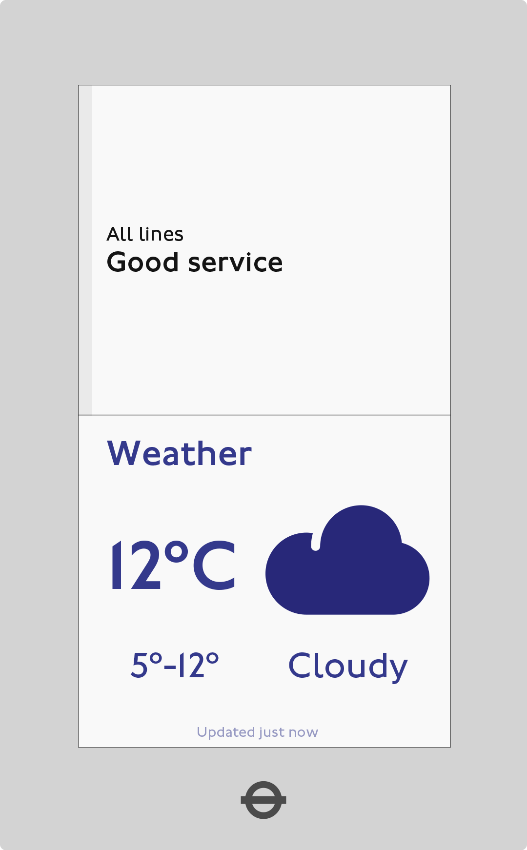
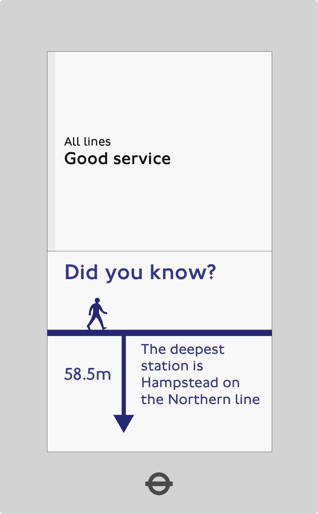
Extending concepts
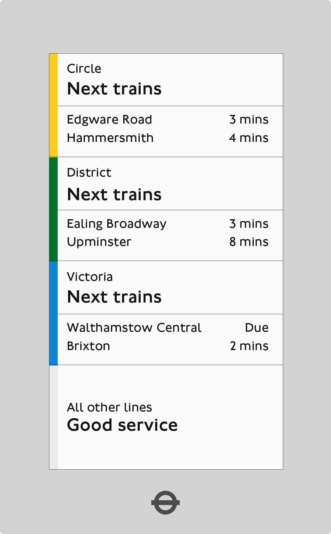
We wanted to extend other key concepts such as next train times, busy stations, quote of the day, weather, etc. We felt that these would add extra value when the network was in a good service.
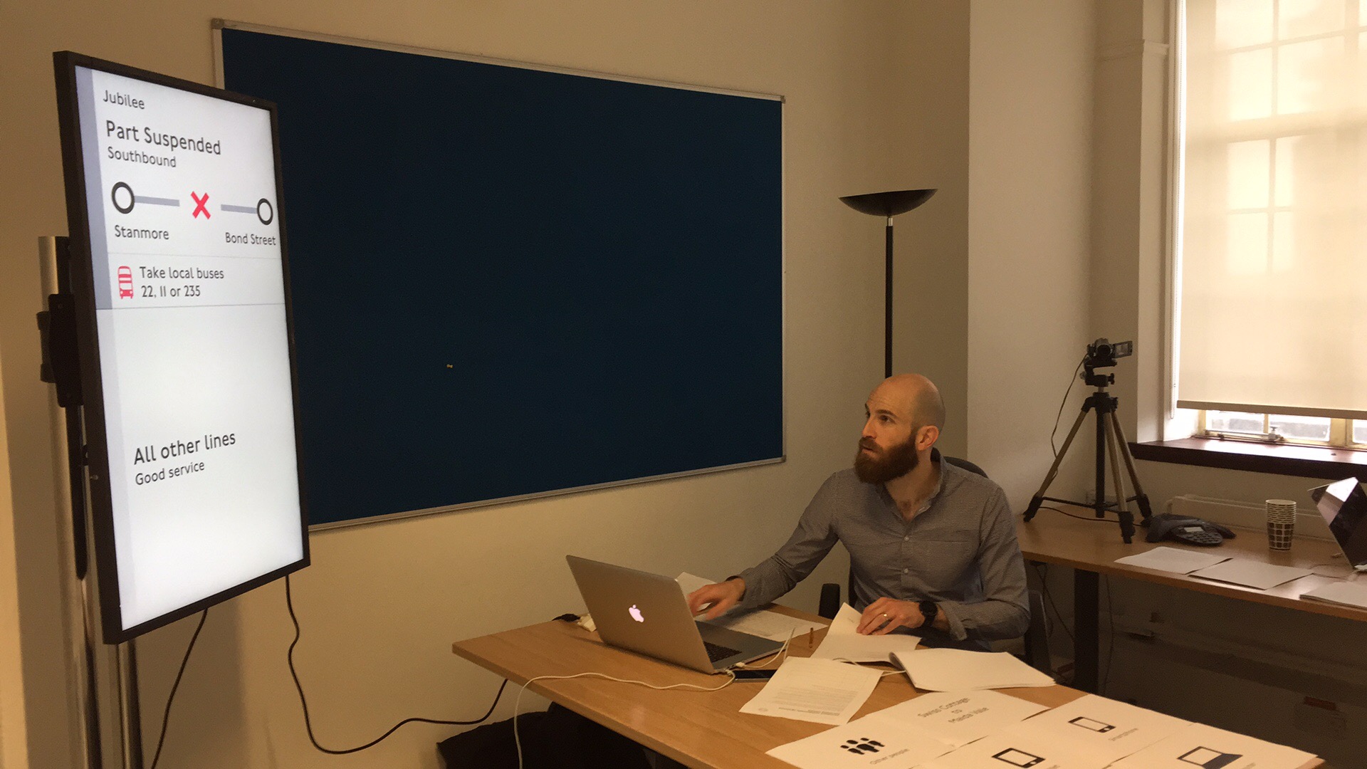
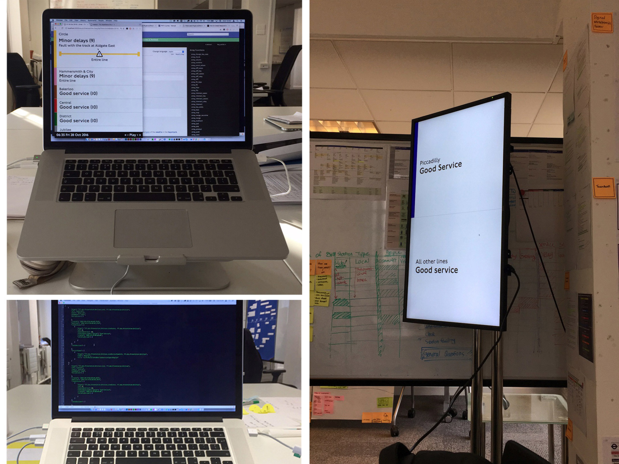
Prototype
We wanted to build a working prototype but there weren’t any dev resources. So I decided to use my own technical skills. I created a basic HTML framework that pulled data from TfL's API using PHP.
Breaking down barriers
The prototype became highly popular, as it broke down the barriers during meetings to be able to see something that is alive and working with real data. I coded it to work across mobile and desktop browsers as well as our new TfL’s standard digital screens – to see the flexibility of the design system.
Timemachine
I also created a separate section called Timemachine that downloads disruption data to allow us to walkthrough each day and see how the prototype reacted to different issues.
Overcoming IT issues
I had to setup and install, Apache, PHP and MySQL on a Windows server, to ensure that we were able to trial the prototype in the IT department’s dev environment.
Trials
After building the prototype, we focused on finding four different types of tube stations that allowed us to run the trial with many kinds of commuters – from tourists to Londoners and even staff. We chose the following stations:
Solving (many) problems
We designed by going above and beyond: we built the digital screen stand to replicate how it looked inside stations, we started afresh with a new digital design standard, we presented the solutions many times to different directors to allow us to get buy in, we developed the prototype, we created the server and implemented the correct tools to allow us to demonstrate the web application. All of the effort allowed us to push what the standard for digital was considered at TfL and this further allowed us to experiment with new ideas and designs. TfL had successful trials in four stations testing the prototype with staff and commuters.
The project has rolled out to all 257+ stations across London. 🥳

Just a bit more little more info
Role
Experience Design Lead
Researcher
UX and UI
Prototype Developer
Team size
2 Designers (including myself)
Software
Sketch
Keynote
HTML & CSS
PHP, TfL API