
Thomson Routers
Thomson Reuters is one of the world’s most trusted providers of answers, helping professionals make confident decisions and run better businesses. Their customers operate in complex arenas that move society forward — law, tax, compliance, government, and media – and face increasing complexity as regulation and technology disrupt every industry.
🎨 Designing for thousands of B2B customers.
Brief
The project was converging around 20 to 30 sites into a single experience to cater to many clients across law, news, accounting and business. I was hired as a UX and Visual Design Lead to help Thomson Reuters on one of their primary web projects.
Outcome
The project was converging around 20 to 30 sites into a single experience to cater to many clients across law, news, accounting and business. I was hired as a UX and Visual Design Lead to help Thomson Reuters on one of their primary web projects.
Here is how we did it 👇
Design
An agency helped design the initial branding for this project, including some Sketch libraries, which included atomic design elements to support the Design team in creating modules/components through to templates. However, a lack of functional spec made it hard to understand how things worked. This obstacle would be a significant challenge that we had to come over as Thomson Reuters’ internal design team.
Design research
Due to the difficulties in understanding the design approach and strategies. I thought putting together a presentation explaining design basics and providing feedback on the design system created was essential. I did this to get everyone on the same page. This presentation tried to bring balance, education and questions about the project. I focused on the following areas:
- Space
- Typography
- Scale
- Colours
- Copy
- Accessibility
- Touch devices
- Input devices
- Patterns
- Iconography
- Orientation
- Signposts
- Progress bars
- Consistent mechanisms
- Feedback
- Repetition
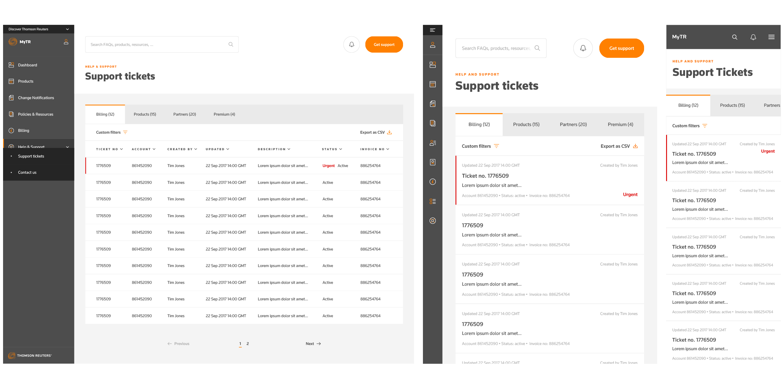
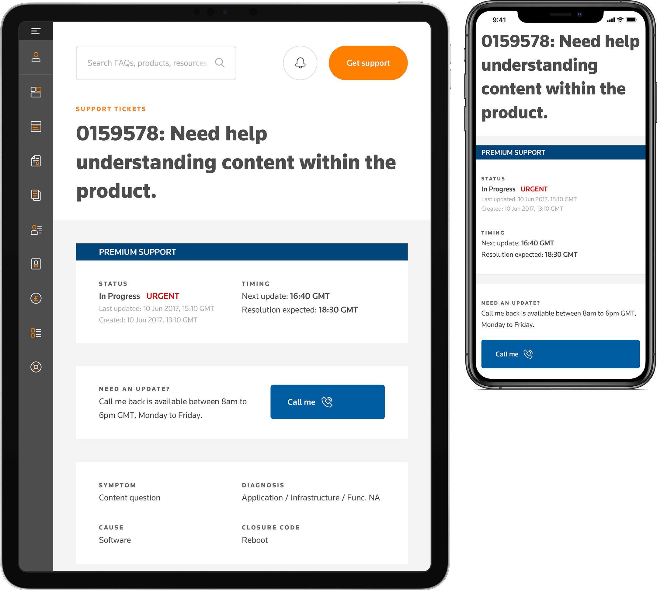
Help & Support
One of the areas I was assigned to look at was the Help & Support area. As there was very little UX documentation, we started from scratch in some design areas. We decided to have several discussions to meet all the business owners and analysts so that they could give us insights in current workflows and customer qualitative data:

We had very constructive discussions and from there we split the section into two areas:
“I have an issue or I need help with something” and “I want to learn”

Visual Design
The design system comprised of a number of Sketch libraries, which included atomic design elements to aid in creating templates, patterns, modules, etc. Across these libraries, we had to ensure that they worked on three viewports: Smartphones, tablets and computers.
During this process, I started up internal discussions to ensure that we were all on the same when it came to designing elements such as spacing, typography, colours and iconography. It was essential to have these discussions early on (and weekly) so that we created consistent designs across all sections and viewports.


Production process
Once we started putting together the templates from all the atoms, it was easy to get into the flow of producing all the correct templates and content for each website area.
We used Trello as a kanban wall between the product team and us to keep track of what we were doing and working on next.
Once we were finished, the PMs would convert the stories from Trello into JIRA tickets that the development team (based in India) could put the tickets into their sprints.
We used google sheets to keep track of our progress using sprint methodology to allow us to estimate and compare different teams together. I liked this method a lot, as it allowed us to keep an open forum to see what everyone was working on and where/when another team needed help.
Each template needed at least three variations: desktop viewport, tablet viewport and phone viewport. It helped to use Sketch libraries and specific plugins that allowed us to easy and quickly change elements around during the design process. We used Invision to communicate the specs to the developers, which proved successful as their production rate increased, from a couple of weeks' estimates to just a few days' estimates.
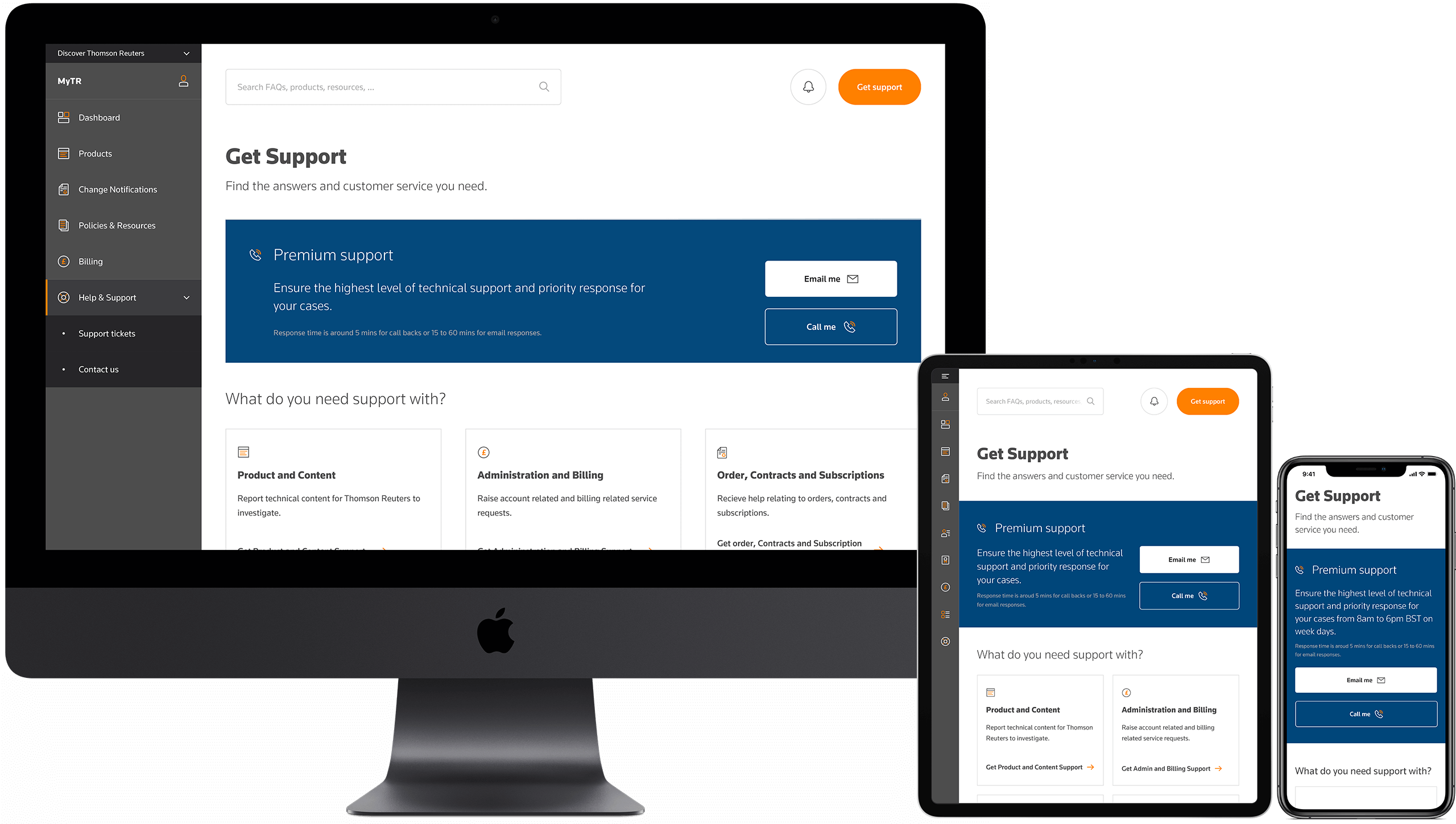
Take me with you
One of the critical aspects of this project was to allow everyone to access their information from any device. This free and open idea gives more power and freedom back to the user driving the data. Being involved in a project like this enforces the essence of this idea.
About
Team size
10 Designers (including myself)
4 Product Managers
4 Engineering teams
Role
UX and UI Lead
Software
Sketch
Keynote