Lloyds Bank
Lloyds Bank
Since its foundation on 3 June 1765, Lloyds Bank has been serving the households, businesses and communities of Britain. It is the largest retail bank in Britain, with around 30 million personal customers and business accounts.
🎨 Designing for 30 million B2C users.
Problem
Booking an appointment was complex at Lloyds Bank. Many systems worked separately, depending on whether a user tried to book an appointment in the branch or on the phone. These different systems for online, in-branch, and on the telephone made it difficult and confusing to set up an appointment and ultimately led to missed appointments while making the whole procedure longer to set up and harder to find.
I led the design of Lloyds Bank's booking appointment system, combining several old systems into a single booking system across in-branch, customer service, and at-home experiences.
The project was partway through the design phase but struggled to get up and running. One of the biggest challenges I faced was ensuring that I kept to the new Lloyds Bank visual language while also implementing (new or old) components that would help the process of booking an appointment.
Outcome
The project wasn’t doing well; it was labelled red status, which meant they were significantly behind. When I joined the project, I coordinated and organised the design sprints that allowed everyone to see what the final product would look like and ordered the designs to improve engineering velocity. This meant that the project went from red status to green status allowing them to deliver the project ahead of time.
Here is how I did it 👇
Design
Lloyds Bank had spent a lot of time developing a visual language that would help push the bank into the era of the internet of things. Considering how slow some banks are design-wise, it was refreshing to see how quickly the bank wanted to adapt to digital change.
One of my first steps was establishing the team structure, speaking to everyone, and understanding the project's current status. From there, I understood what the project goals were and how to use my skills best to help.
UX
The team showed me all the user stories and the development ins and outs. But I didn’t want to distract myself with all this. So I started by speaking to the UX designer already involved. I looked through her prototype of the booking appointment (created in Axure). This approach ensured I could tackle all the design tasks with a fresh perspective.

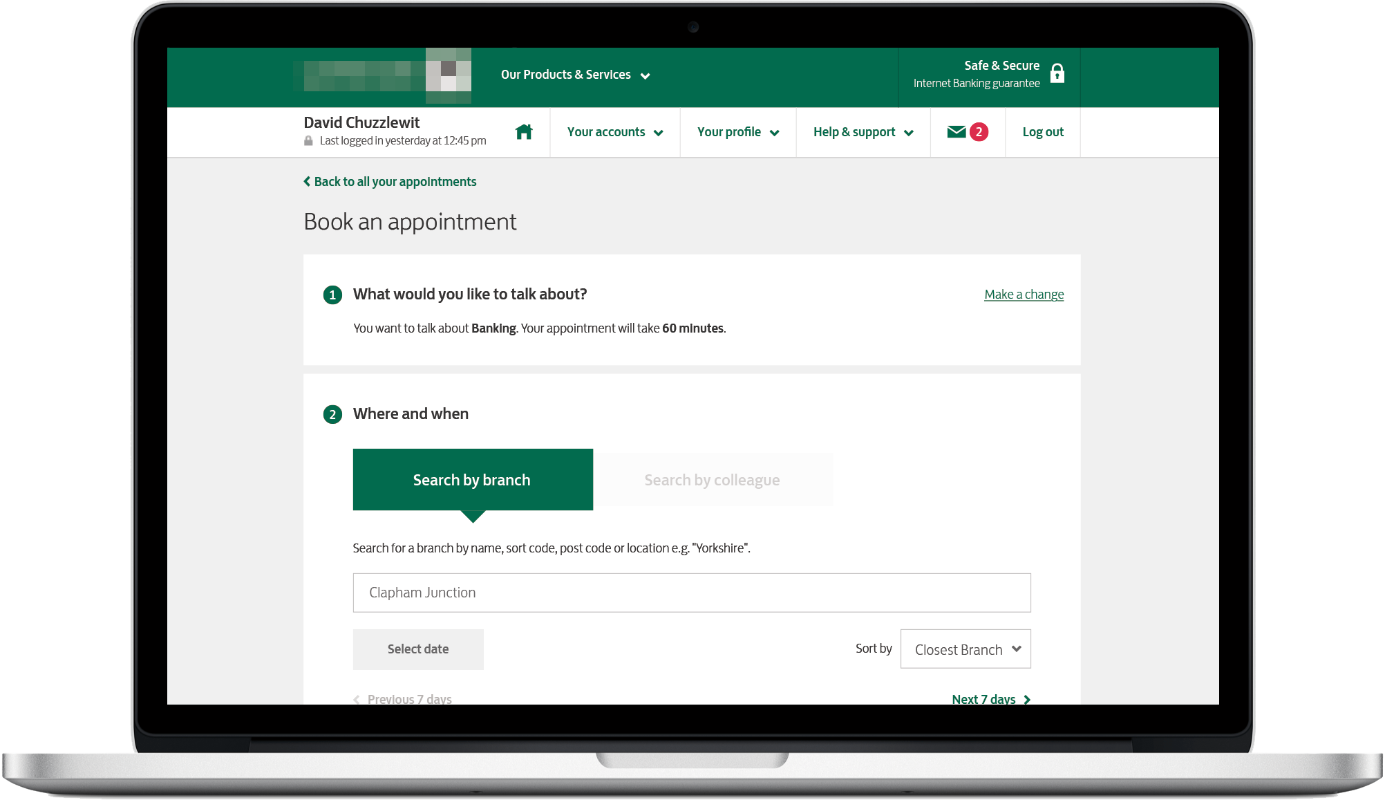
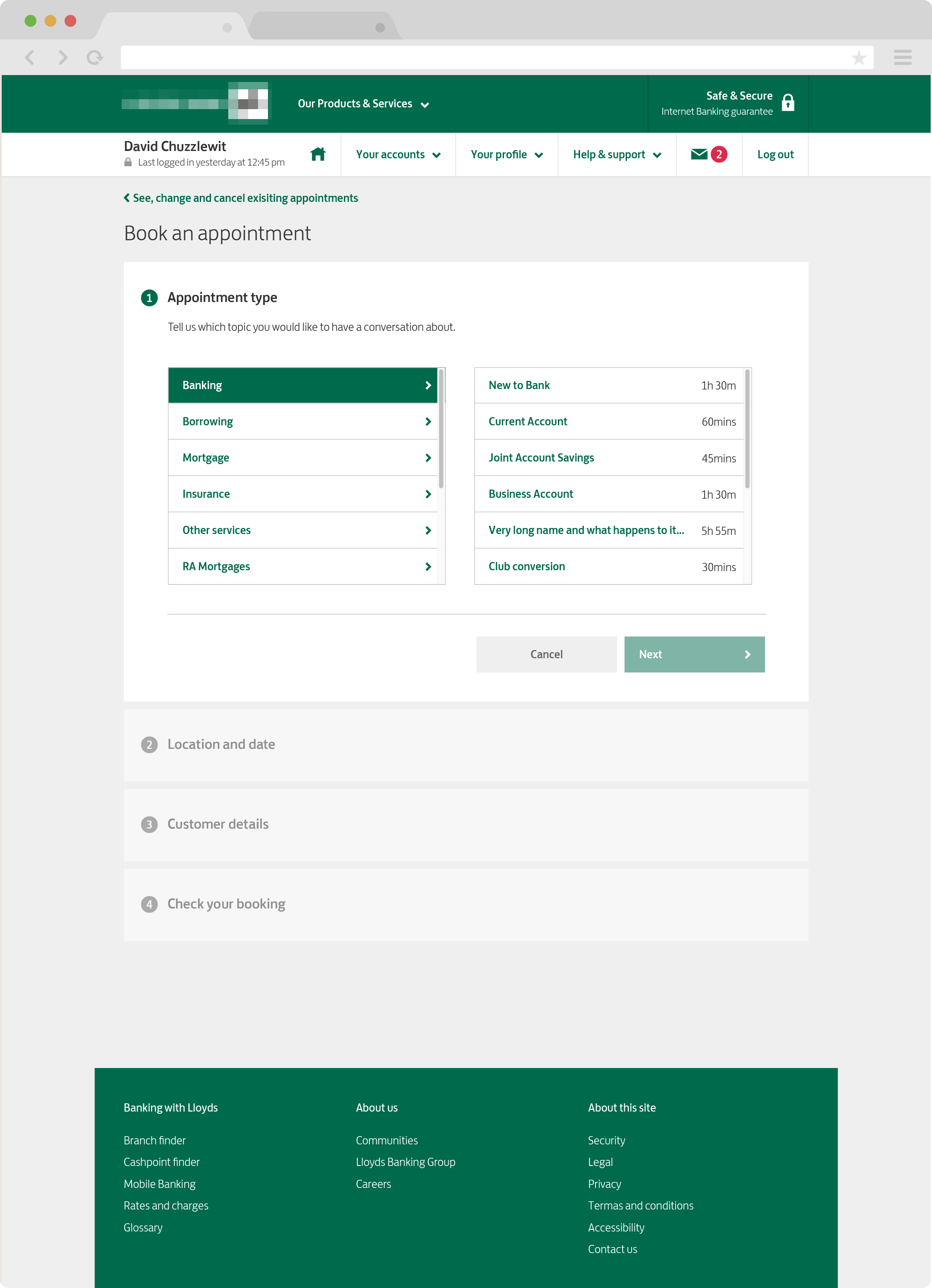
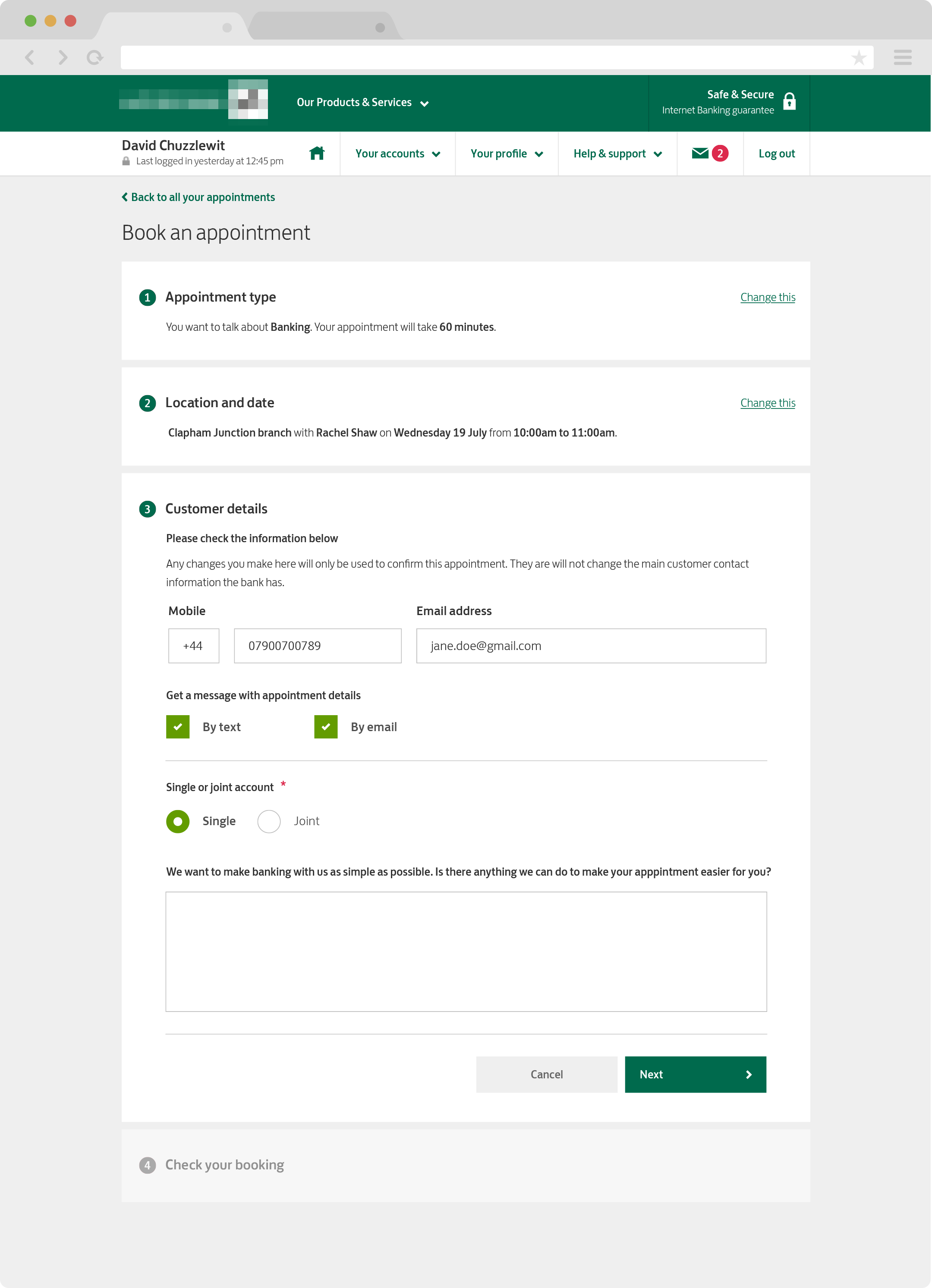
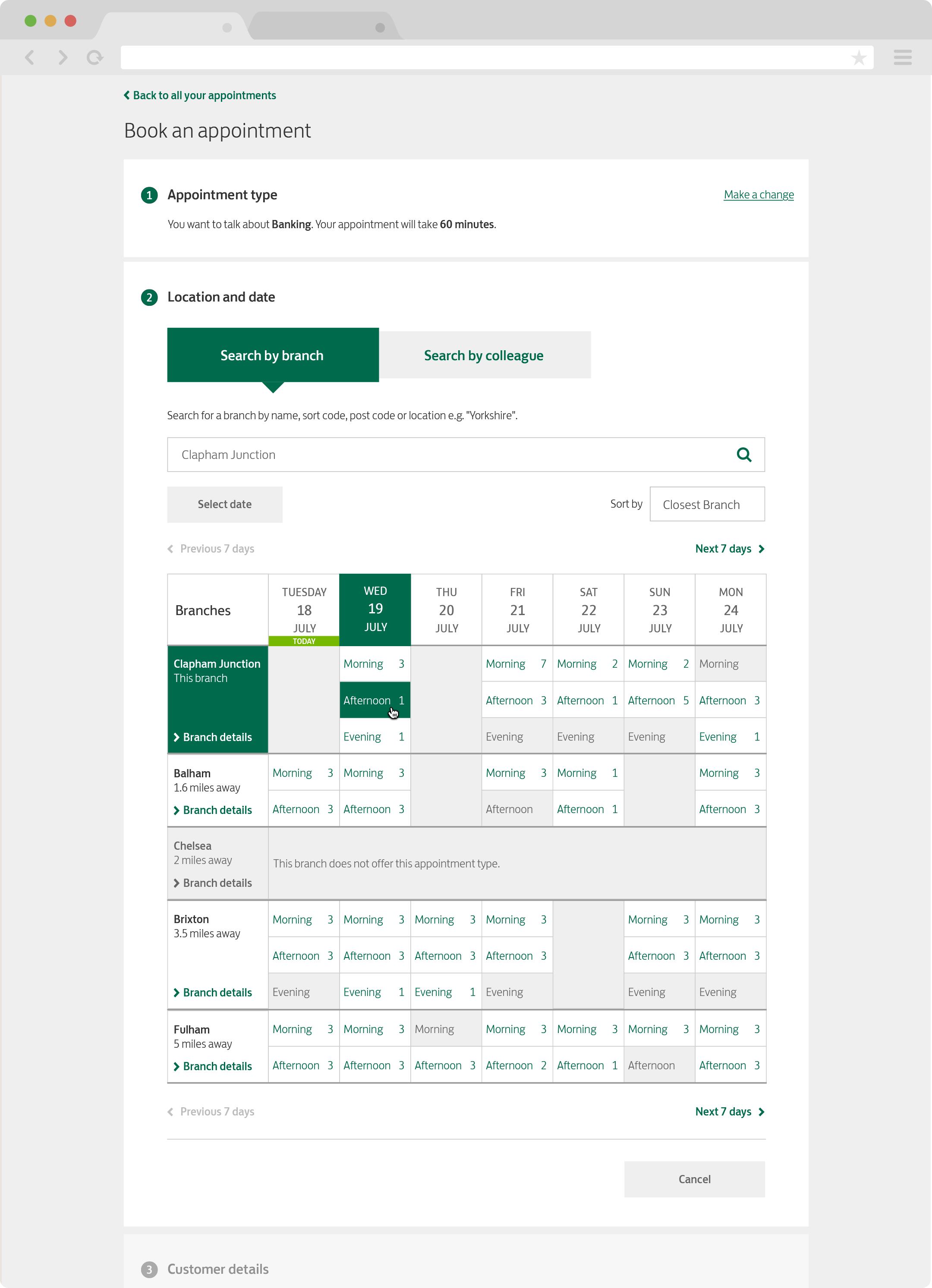
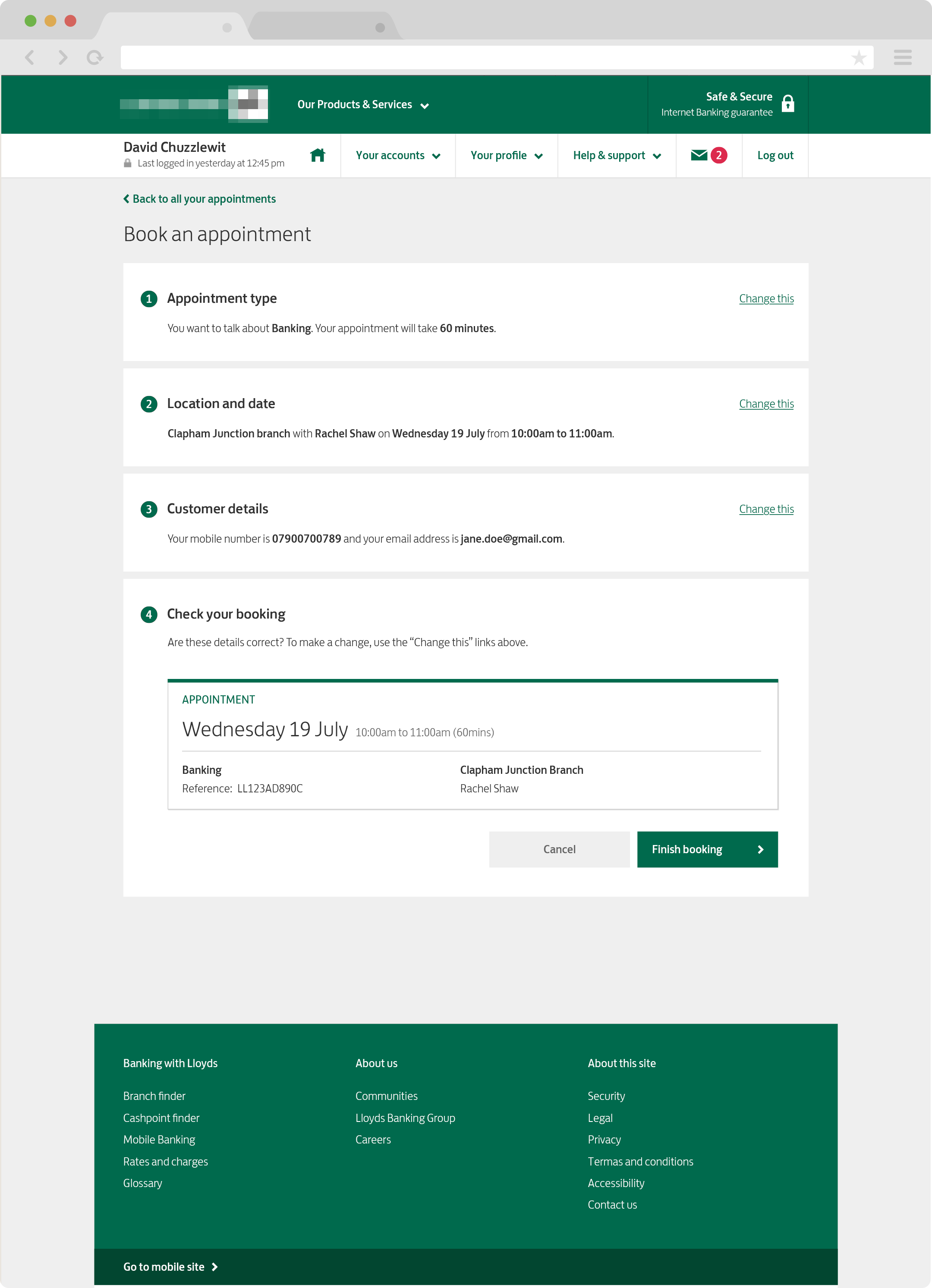
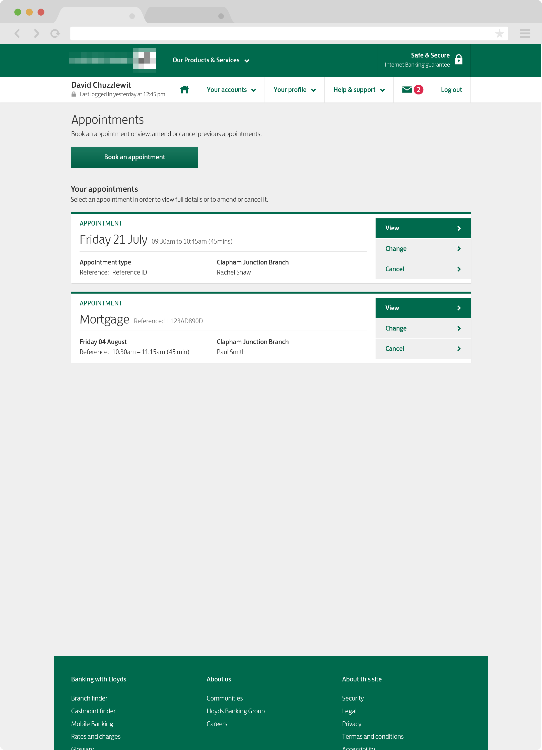
The whole journey was a complex form, now split into separate and easy to digest forms while remaining on a single page. This approach would allow a user or a member of staff to go through booking an appointment without having to deal with too much data. We had to consider confirmation pages, error pages, and emails as part of the design phase.

Delivering
After a couple of days, I began creating a list of deliverables by going through the team's priority list with the scrum master. I used this approach to ensure that the dev team had the required design specifications when they needed to do front-end work. I developed the design specification in the following order:
1) Page template
2) Home page
3) Appointment type section
4) Location & date section
5) Customer details section
6) Check appointment section
7) Appointment confirm page
8) Cancel appointment page
9) Error templates
Visual language
While working on this project, I had to familiarise myself with the huge Sketch libraries that covered Lloyds Bank and Bank of Scotland and Halifax, as all of these are owned by Lloyds Bank and use similar templates.
It was essential to find out what the differences were: visual elements such as the typography, iconography and colours needed to be understood entirely before I could deliver any work.
Concepts
The primary purpose was to bring as much of the current visual language into this project while bringing new components that blended into the existing style. This project had to work on the iPad (in-branch) and Desktop (computer at home or in a telephone centre). It was vital to check that each template worked well within both viewports.
Each page needed to work seamlessly across three brands (Lloyds Bank, Bank of Scotland and Halifax) and on an iPad and Desktop computer. That’s a lot of variations for each page: 36 pages x 3 brands = 108 pages!

Production
I kept things simple by allowing myself space to work on the initial designs. From there, I was able to split all the design work into manageable sprints that were focused on delivering components within templates. This approach ensured that the developers could see the bigger picture of how everything fits together while developing complex components that worked across multiple scenarios.
Conversion sheets
How do you deliver six varieties for each page without confusing everyone? Well, I created conversion sheets! I gave the developers one brand of templates and then used conversion sheets to bridge the other brands. This helped ensure the design was consistent across all three brands and allowed the developers to work a lot quicker than expected.

Design value
The project wasn’t doing well; it was labelled red status, which meant they were significantly behind. When the UX designer joined the project, they automatically saw the value of design, and their project went to amber status. Finally, when I joined the project, I added another design layer and management that allowed everyone to see the final product and organise the designs to improve delivery speeds. My side interests in development also allowed me to think of innovative ways to help increase the developers' productivity. The project changed to green status, the highest level a project can reach.
Ensuring I kept a high level of quality helped bring the team together and allowed everyone to be on the same page during the process.
I always tell everyone that each layer of design is a layer of conscious thought. Each layer of fidelity adds more refinement to the project, getting it closer to being the product a customer wants to use and can use easily.
About this project
Team size
2 Designers
1 Scrum master
1 Product owner
5-8 Developers
Role
Design Lead
Software
Sketch